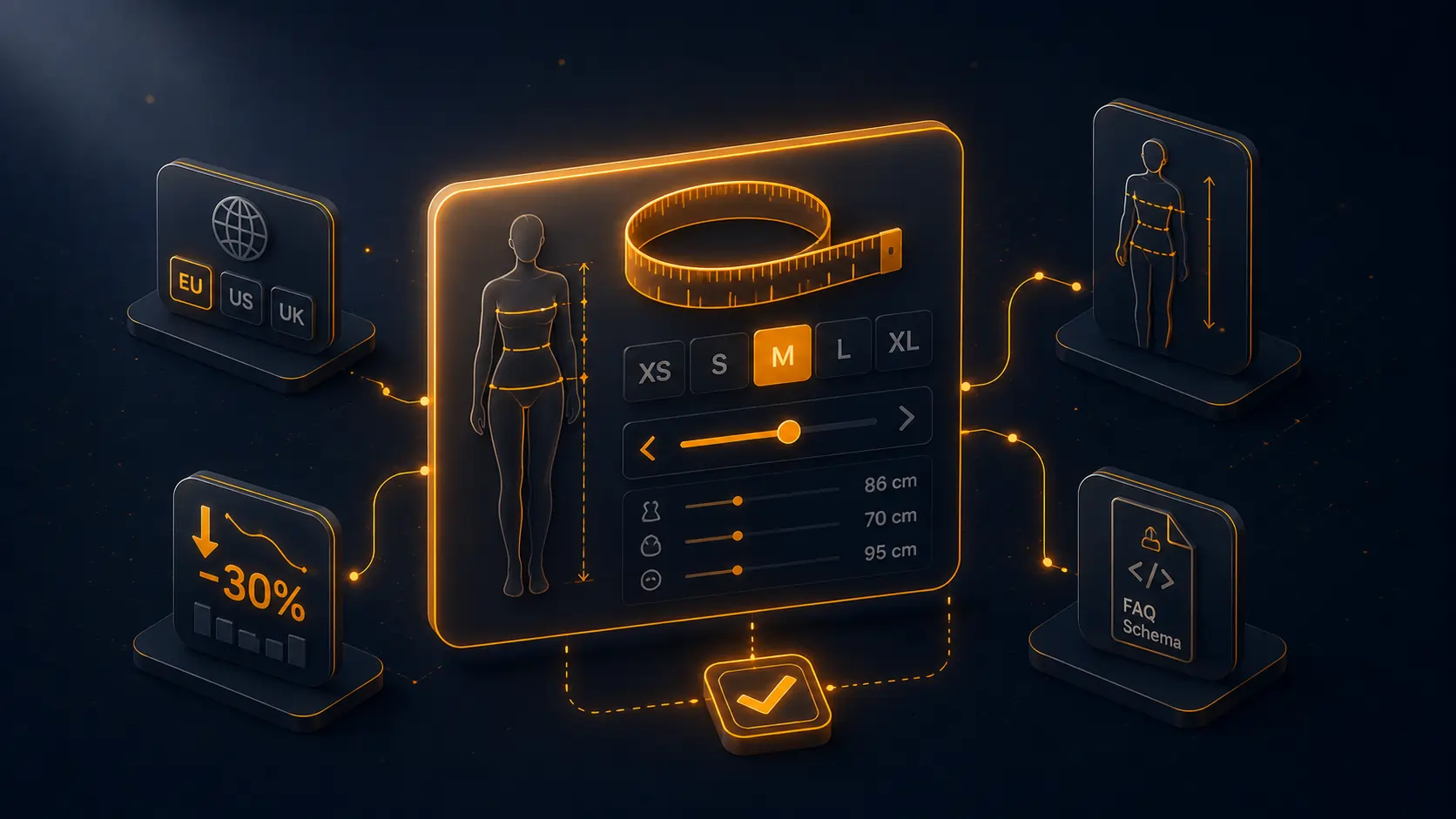
On a standard fashion store, the return rate runs between 25 and 40%. According to Statista and ASOS studies published in 2024-2025, nearly 70% of returns are due to a sizing issue — item too big, too small, or felt that way after delivery. On a store doing £800K in annual revenue, bringing the return rate from 35% to 25% means £80K of retained revenue, before counting the logistics costs avoided (receiving, QC, restocking, return shipping).
The size guide is the number-one tool to tackle this problem, and it’s also the one most stores handle worst. This article unpacks the anatomy of a size guide that actually works, the traps that neutralise it, and its often-overlooked SEO role in 2026.
Why standard size guides fail
The “classic” size guide — a PNG image with a UK/EU/US table — ticks the minimal legal and UX box, but barely changes the return rate. Why?
- The customer doesn’t know how to measure themselves. An arm length or hip measurement without an anatomical reference stays an abstract number. Without a diagram, video or contextual help, the customer fills it in at random.
- The table doesn’t account for fit variation. A UK 12 has a different cut at Reiss, COS and Levi’s. A generic guide without brand/fit personalisation misses conversion.
- The PNG isn’t accessible. Not mobile-readable, not Google-indexable, not exploitable by screen readers. And it costs LCP on the product page.
- It’s hidden behind a tab. 60 to 80% of visitors don’t open it. For a guide to impact return rate, it must feel like proactive help, not an annex.
- No memory between visits. The customer redoes the exercise on each purchase. By the second time, they give up and buy at random.
The anatomy of a size guide that lowers return rate
1. Anatomical diagram with measurement references
A clear, mobile-friendly drawing showing exactly where to measure: chest circumference under the arms, waist at the narrowest point, inseam at the inguinal fold. Without this, the entered measurements are at best approximate, at worst incoherent (chest = 75 cm for a UK 14, mathematically impossible).
2. Interactive calculator
The customer enters their measurements, the calculator recommends the appropriate size. The feature that changes everything. Measured conversion: +12 to +20% vs static guide, return rate: -8 to -15 points.
3. Per-product personalised recommendation
The calculator doesn’t return a generic size but the size matching the model viewed, accounting for fit specifics (slim, regular, oversize). This requires per-model mapping — real structured data, not a PNG.
4. Display of three standards (UK/EU/US)
A store selling internationally can’t get away with the UK system alone. The right guide shows the three conversions side by side, with the customer’s size highlighted in their usual system.
5. Customer measurement memory
Once entered, measurements are stored locally (cookie or localStorage) or in the customer account. The next visit, the guide pre-fills. Customer friction reduced, guide reuse rate multiplied by 4.
6. Dedicated SEO page
An indexable /size-guide page, with editorial content (“how to measure yourself”, sizing FAQ), generates informational traffic and captures “size guide [brand]” queries. The editorial investment is paid back by SEO on top of the conversion gain.
The overlooked SEO role of the size guide
Queries containing “size guide” generate millions of monthly searches. A visitor typing “men’s trouser size guide” on Google is not in mid-purchase — they are in research mode. If your page ranks well, you catch them early in the funnel.
Moreover, since the rise of AI Overviews and answer engines (ChatGPT, Perplexity), well-structured size guide pages are often cited as sources. A guide page with FAQ Schema (“How do I measure for trousers?”, “How to convert a US size to UK?”) appears in AI answers.
Concretely, on a UK fashion store we have supported, the dedicated size guide page now drives 8 to 12% of total SEO traffic, with an attributed conversion rate of 1.5 to 2% — above the store average.
Technical implementation: three approaches
Approach 1 — static page with an image
The simplest, and the least effective. Ticks the minimal UX box, doesn’t move the needle on return rate or SEO.
Approach 2 — popin with HTML table
Better: a table in a Bootstrap popin, multi-tab UK/EU/US. Weak SEO (content in JS), but acceptable accessibility. A decent starting base.
Approach 3 — interactive guide with calculator and dedicated page
Module or custom development: indexable dedicated page, popin on product page that reuses the page content, JS calculator, localStorage memory, editorial content. The only approach that covers the three objectives (conversion, returns, SEO).
Our dfsizeguide module: the intelligent size guide
Implementing approach 3 by hand takes 5 to 10 days of front + back dev, plus editorial writing. Our dfsizeguide module for PrestaShop 8 and 9 industrialises the whole mechanic:
- Multi-system tables UK / EU / US / custom, per product category and per model.
- Interactive calculator that takes customer measurements and recommends the appropriate size.
- Dedicated SEO page
/size-guidewith editorial content and FAQ Schema. - Popin on product page that reuses the page content, without duplication.
- Three standards displayed side by side, configuration per multi-shop store.
- Customer measurement memory via localStorage, optionally linked to the customer account.
- Per-category or per-product mapping: a single catalogue can have different guides for tops, bottoms, footwear.
- Multilingual EN/FR/ES/DE with translation of labels and units.
- No theme modification: 100% via hook.
For €29, it is one of the best conversion + returns ROI in the PrestaShop catalogue.
Concrete numbers
On a fashion store with £800K annual revenue and a 35% return rate:
- Before intelligent guide: £280K of returned merchandise, or £56-80K of net cost after restocking and logistics.
- After intelligent guide (8-point return rate reduction, conservative hypothesis): £216K of returned merchandise, or £40-60K of net cost. Net gain: £16-20K/year.
- Plus the conversion gain (hesitant customers who dare to order thanks to the guide): +1 to +2% conversion rate, i.e. £8-16K of additional revenue.
- Plus the SEO: 5 to 15% additional traffic on the indexed guide page.
Annual ROI: £24-50K for a €29 module. The cost/benefit ratio is unmatched in the PrestaShop catalogue.
Traps to avoid
- Generic guide for the whole store. If you sell tops, bottoms, shoes and accessories, you need several guides — not a single unreadable mega-guide.
- Measurements in inches AND centimetres without toggle. The table becomes unreadable. Clean UK/EU toggle by default.
- Calculator without validation. If the customer enters a 250 cm chest, the calculator must reject it, not recommend an absurd 6XL.
- High-resolution unoptimised PNG image. 800 KB of PNG kills the product page LCP. Optimised WebP and lazy loading, always.
- No mobile version. 70% of fashion traffic is mobile in 2026. A horizontally-scrolling table on mobile is dead on arrival.
FAQ
Is the size guide mandatory in e-commerce?
Not strictly mandatory, but the absence of a guide or a misleading guide can be qualified as a “misleading commercial practice” under UK consumer protection law (Consumer Protection from Unfair Trading Regulations 2008, updated by the DMCC Act 2024), especially in apparel. Beyond compliance, it is a central commercial tool.
How to handle brands with very different fits?
The mapping must be done at the product or model level, not the global level. A serious module lets you define tables per brand, per collection, even per reference. If your store mixes Levi’s slim and Carhartt regular, don’t apply the same table.
Should I offer a remote measurement service?
AI photo-measurement services (Bold Metrics, Sizolution) are relevant above £4M in revenue. Below, the ROI doesn’t cover the integration and subscription. A clean classic calculator covers 90% of the need.
How to display the guide on mobile without breaking the product page?
On mobile, the guide should open full-screen (bottom sheet or full-page modal), not a compressed popin. And closing should be easy. The “bottom sheet swipe-to-close” pattern has become the 2026 norm.
Should the guide be placed before or after the size selector?
The “Size guide” link must be visible right next to the size selector, not in a tab at the bottom. Optimal position: to the right of the “Size” label with a clear icon and short text. Always below the add-to-cart line so as not to distract from the main action.
To go further
The size guide is one of the levers for improving the post-purchase funnel. Three complementary levers: decision (guide), engagement (wishlist), action (product page).
To put this into practice: our modules for selling fashion and textile and our selection to manage product returns.