
Our best PrestaShop modules to speed up your checkout
Seven modules to strip out, one by one, the frictions that lose customers who had already decided.
The customer has chosen, filled the cart, clicked "Checkout" — and that is where you lose them. Checkout abandonments are the most expensive of all, and almost always caused by friction, not price.
Sound familiar?
Forced account creation
The customer wants to pay, not to sign up. By far the leading cause of checkout abandonment, across every sector.
Seven fields for one address
Badly formatted postcode, mismatched city, typing on a phone. Two minutes of irritation before paying.
Sixteen digits to type on mobile
Pull out the card, flip it, type. Every step is a chance to give up — and on mobile there are many.
A field that rejects a valid number
The form refuses the phone number because the format is wrong. The customer does not fix it: they leave.
Our selection, ranked
Every module below is built, maintained and supported by our team. The ranking reflects what we would install first on a client store.
-
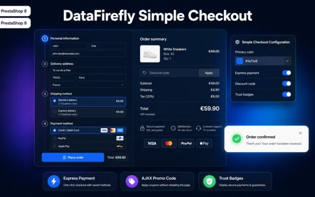
Simple & Elegant Checkout for PrestaShop
The foundationA streamlined funnel with no superfluous step. It is the base every other module bolts onto — start here.
Replace PrestaShop's 5-step checkout with a modern, clean one-page layout. Natively compatible with Stripe, PayPal, Alma, Colissimo, Mondial Relay and all your payment and…
€99.00 View the module -
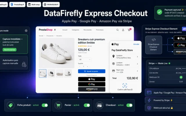
DataFirefly Express Checkout — Apple Pay, Google Pay & Amazon Pay via Stripe (PrestaShop 8 & 9)
Biggest win on mobileApple Pay, Google Pay and Amazon Pay via Stripe. Fingerprint payment removes the funnel's most expensive step.
Show Apple Pay, Google Pay and Amazon Pay buttons via Stripe on the product page, in the cart and at checkout. A single Express…
€49.00 View the module -
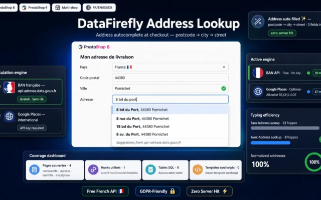
DataFirefly Address Lookup – Checkout address autocomplete for PrestaShop 8 & 9
Best for the addressAutocomplete turns seven fields into three keystrokes, and removes the typos that cause failed deliveries along the way.
Cut address typos and speed up checkout. The free French BAN API (api-adresse.data.gouv.fr) is the default engine, with Google Places available as an option…
€29.00 View the module -
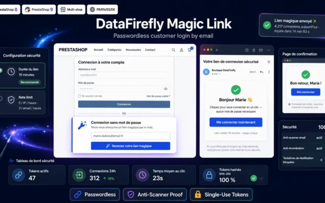
Passwordless Login (Magic Link) for PrestaShop 8 & 9
Best against sign-upThe magic link: the customer logs in by email, no password. The account exists, but it costs them nothing.
Passwordless login through a single-use email link. Hashed tokens, anti-prefetcher, anti-enumeration, rate limiting, multilingual emails. Compatible with PrestaShop 8 and 9.
€49.00 View the module -
Social Login (Google, Apple, Facebook) for PrestaShop
Sign-up in one clickGoogle, Apple and Facebook login. The natural companion to the magic link, for customers who prefer the ecosystem they already use.
One-click sign-in via Google, Apple and Facebook for PrestaShop 8 and 9, with a full analytics dashboard, automatic welcome vouchers and a signed CRM…
€49.00 View the module -
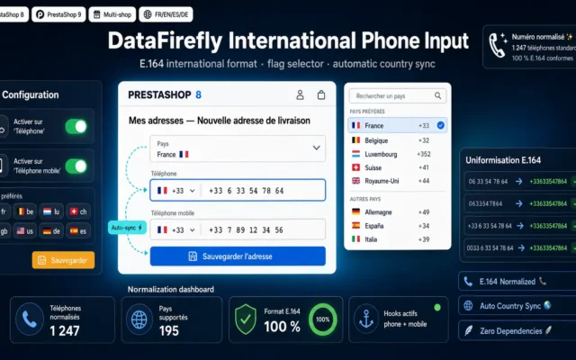
International Phone Input PrestaShop — Flags & E.164 Normalization
The invisible frictionFlags and E.164 normalisation. A detail — until you measure how many customers leave on a rejected phone field.
Adds a country flag selector with dial code on the phone and mobile phone fields. Automatic E.164 international format normalization in the database. Compatible…
€39.00 View the module -
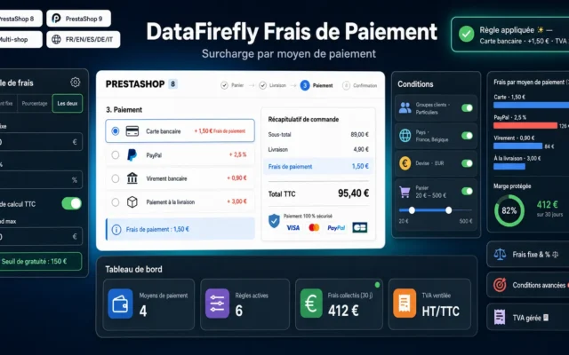
DataFirefly Payment Fees — Surcharge per payment method (PrestaShop 8 & 9)
Pricing transparencyPayment-method surcharge, shown before the choice. A cost shown early converts better than a cost discovered late.
Add fees (fixed amount and/or percentage) to each payment method on PrestaShop 8 and 9. Rules engine with conditions by customer group, country, currency…
€49.00 View the module

Side-by-side comparison
| Module | Best for | Price | Rating | Link |
|---|---|---|---|---|
| Simple & Elegant Checkout for PrestaShop | The foundation | €99.00 | — | |
| DataFirefly Express Checkout — Apple Pay, Google Pay & Amazon Pay via Stripe (PrestaShop 8 & 9) | Biggest win on mobile | €49.00 | — | |
| DataFirefly Address Lookup – Checkout address autocomplete for PrestaShop 8 & 9 | Best for the address | €29.00 | — | |
| Passwordless Login (Magic Link) for PrestaShop 8 & 9 | Best against sign-up | €49.00 | — | |
| Social Login (Google, Apple, Facebook) for PrestaShop | Sign-up in one click | €49.00 | — | |
| International Phone Input PrestaShop — Flags & E.164 Normalization | The invisible friction | €39.00 | — | |
| DataFirefly Payment Fees — Surcharge per payment method (PrestaShop 8 & 9) | Pricing transparency | €49.00 | — |
The funnel is a countdown
Between the moment a customer clicks “Checkout” and the moment they confirm payment, every second and every field is an opportunity to give up. Checkout is not an administrative step: it is where you lose the customers who had already decided to buy. Those are the most expensive abandonments of all.
The good news is that these abandonments are almost never about the product or the price. They are about friction. And friction can be removed.
The four costliest frictions
Forced account creation. By far the leading cause of checkout abandonment. The customer wants to pay, not to sign up. Social login and magic links solve it without giving up the customer account.
Address entry. Seven fields, a badly formatted postcode, a city that does not match the region. Autocomplete turns two minutes of irritation into three keystrokes.
The card form. Pull out the card, flip it over, type sixteen digits on a phone. Apple Pay and Google Pay remove that step entirely: payment happens with a fingerprint.
The phone number. A field that rejects a valid number because the format is wrong is an insult to the customer. E.164 normalisation accepts anything and tidies up behind the scenes.
Transparency is an accelerator
A customer who discovers fees on the final screen does not pay them: they close the tab. If your shop applies a payment-method surcharge, show it before the choice, not after. It is counter-intuitive, but showing a cost early converts better than hiding it late.
How to choose
Where to start
With the checkout itself. A streamlined funnel is the foundation: there is no point adding Apple Pay to a four-step checkout with ten optional fields. Remove first, add second.
Ranked by real gain
- Express payment — Apple Pay and Google Pay remove card entry, the funnel's most expensive step on mobile. By far the highest-impact lever if your traffic is mostly mobile.
- Address autocomplete — it saves time and removes the typos that cause failed deliveries. A double benefit, the second of which shows up in your support costs.
- Passwordless login — magic link and social login. Install them together: they cover two different customer profiles.
- Phone normalisation — the quietest of the set, but a field that rejects a valid number sends away a customer who had already decided.
Guest checkout: the real question
Many shops agonise between forcing an account (for retention) and making it optional (for conversion). It is a false dilemma. With magic links and social login, the account is created with no perceived effort: the customer goes through no sign-up, yet you get a usable account. You no longer have to choose.
What nobody measures
Abandonment rate per step. Without it you optimise blind. Before installing anything, instrument your funnel: you will often find the friction is not where you thought — and sometimes that it sits on a field you would have sworn was harmless.
What you gain
Payment with a fingerprint
Apple Pay, Google Pay and Amazon Pay via Stripe: no card number to type. The single biggest win on mobile.
The address in three keystrokes
Autocomplete suggests the full address from the first characters, and fills every field correctly.
No password to remember
Magic link by email, or Google / Apple / Facebook login. The account exists, but it costs the customer nothing.
A stripped-down funnel
Fewer steps, fewer fields, fewer distractions. Every element removed from checkout is one abandonment fewer.
Numbers always accepted
E.164 normalisation with country flags: the customer types how they like, the module tidies up. No more absurd rejections.
Fees announced, not endured
The payment-method surcharge appears before the choice. Showing a cost early converts better than hiding it late.
From install to results
-
Measure before you touch anything
Instrument the funnel to get abandonment per step. Friction is rarely where you assume it is.
-
Strip the checkout down
Remove superfluous steps and fields. It is the foundation: no point adding Apple Pay to a four-screen funnel.
-
Add express payment
Apple Pay and Google Pay via Stripe. On mostly mobile traffic, this is the highest-impact lever by a wide margin.
-
Remove the sign-up
Magic link and social login together: the account gets created without the customer feeling they signed up.
-
Hunt the invisible frictions
Address autocomplete and phone normalisation. Details — until you measure what they cost.
“We spent months on the product page design. The day we instrumented the funnel, we found 14% of customers were leaving on the phone field, because it rejected numbers with spaces in them.”
Frequently asked questions
Should I really drop forced account creation?
Yes, but the question is framed wrong. It is not "account or no account", it is "perceived sign-up or not". With a magic link or social login, the customer account is created — you keep the history, the retention, the support context — but the customer filled in no sign-up form. You no longer have to trade conversion against retention.
Are Apple Pay and Google Pay worth the integration effort?
If your traffic is mostly mobile, this is the highest-impact lever in the whole selection. Express payment removes the funnel's most expensive step: typing sixteen card digits with a thumb on a six-inch screen. On desktop the gain is more modest, but still positive.
Does express payment bypass my usual checkout?
No, and that matters: the module slots into the existing funnel. The customer can pay express from the product page or the cart, or follow the classic checkout if they prefer. Both paths feed the same orders, the same statuses and the same accounting.
Does address autocomplete work outside France?
Yes. The module is multi-provider: it can rely on the French national address database for France, and on international providers elsewhere. You choose the provider per country according to accuracy and cost.
Is the magic link secure?
The link carries a signed, single-use, short-lived token. It is sent to an email address the customer thereby proves they control — the same principle as password reset, which everyone already accepts. In practice it is often safer than a password reused across ten sites.
Is a payment-method surcharge legal?
In Europe, the payment services directive bans surcharging on consumer cards from the common schemes (Visa, Mastercard). It remains possible on other methods (some commercial cards, transfers, instalment plans depending on the case). The module lets you configure finely, but compliance is your legal call — check your situation before switching it on.
Do these modules slow the checkout down?
Autocomplete and express payment make asynchronous calls that stay out of the initial page render. In practice, a streamlined checkout with these modules loads faster than the native checkout cluttered with useless blocks: you remove more than you add.
Can they all be installed together?
Yes, they do not overlap: each tackles a distinct friction. The only ordering rule: strip the checkout first. Adding express payment to a four-step funnel is like fitting a racing engine to a car with the handbrake on.
Not sure which one fits your store?
Tell us your context — we answer with a straight recommendation, not a sales pitch.