
Our best PrestaShop modules to optimise your product pages
Eight modules to answer question by question, and only what your customer actually asks.
Your product page is your only salesperson, and it gets one shot. Everything it fails to answer turns into doubt — and doubt does not add to cart. These modules answer the questions your customers are actually asking.
Sound familiar?
Colours you cannot see
The customer has to open a dropdown to see the colours. They do not open it: they leave.
Sizes you have to guess
With no size chart, the customer guesses. They buy — and they send it back. That is your most expensive sale.
Questions that arrive too late
"Is it compatible with…?" The same question, ten times a week, in support. Never on the page, where it would serve everyone.
A comparison that exhausts
To compare two products, the customer bounces five times between listing and page. They do not last.
Our selection, ranked
Every module below is built, maintained and supported by our team. The ranking reflects what we would install first on a client store.
-
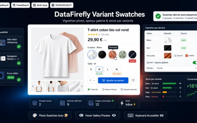
Variant Photo Swatches & Stock Module PrestaShop 8/9
The visual leverPhoto swatches with stock: the customer sees the real colours and availability without opening a drop-down.
Replace combination dropdowns with clickable photo swatches, gallery preview on hover, and per-variant stock visibility. The conversion lever for fashion, home decor and cosmetics…
€89.00 View the module -
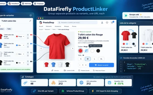
Group Products as Variants in PrestaShop 8 & 9: Amazon-Style Color and Size Selector
Every colour on one pageSeparate products grouped under an Amazon-style colour and size selector. The customer sees every variant from the page they're on, and each product keeps its URL and rankings.
Link separate product pages so they show as one item with a color or size selector, like on Amazon. Each variant keeps its own…
€129.00 View the module -
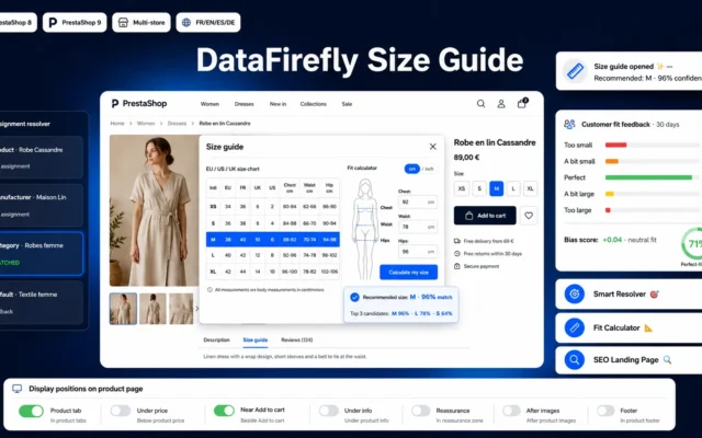
DataFirefly Size Guide — PrestaShop 8 & 9 module
Best for returnsThe size guide is the only lever that sells more and generates fewer returns. In fashion, install it first.
EU/US/UK size charts assignable by category, manufacturer or brand × category combo, with brand and product exclusions, a calculator that separates exact fits from…
€59.00 View the module -
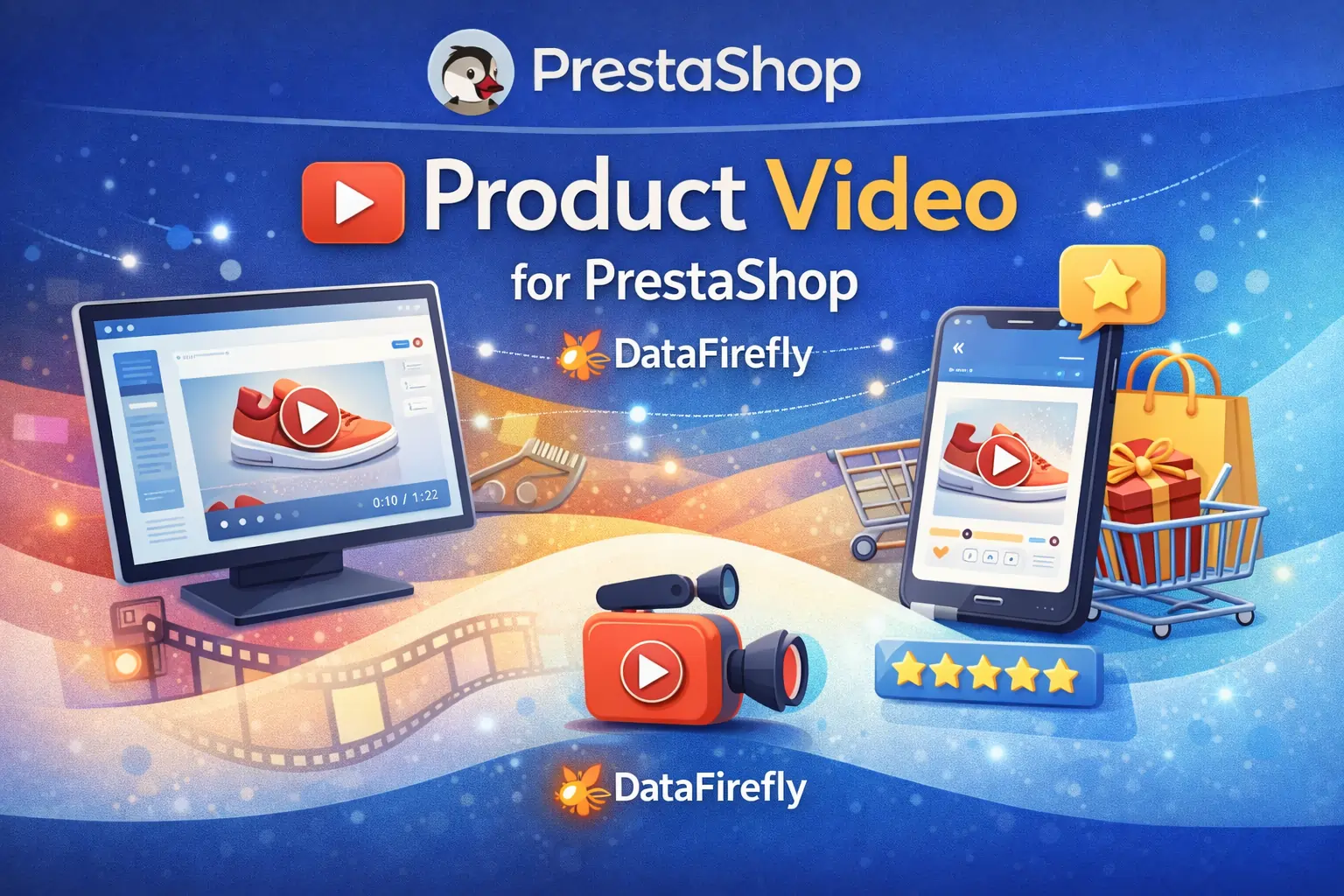
Video in the product gallery — PrestaShop
Shows what the photo hidesScale, movement, materials. Loaded on click: zero impact on Core Web Vitals.
Add video where it converts best: the thumbnail gallery. Three sources (MP4, YouTube, Vimeo), configurable position, native lazy loading, full-screen lightbox.
€120.00 View the module -
Product FAQ — Static Accordion
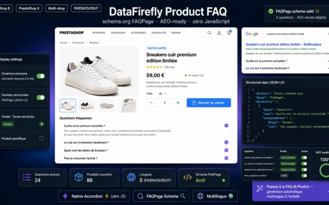
Best for SEOThe product FAQ anticipates questions and becomes indexable long-tail content, quoted by generative assistants.
Display an FAQ accordion under your product pages. Manual entry, schema.org FAQPage markup, zero JavaScript. Compatible with PrestaShop 8 & 9, multistore and multilingual.…
€0.00 View the module -
Quick View Module for PrestaShop 8/9 — Product Quick Preview
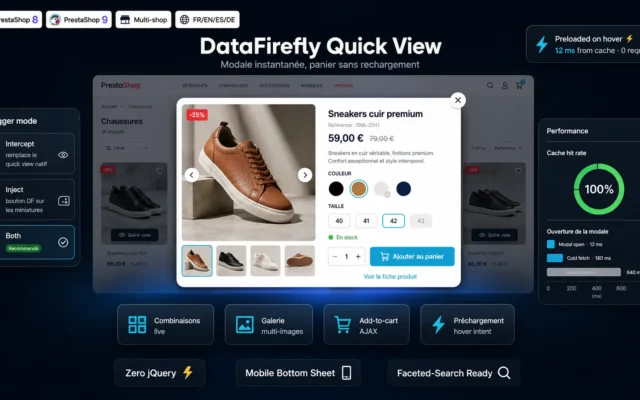
Best for comparingQuick view removes the back and forth between listing and product page. Powerful on large catalogues of similar products.
A modern quick view modal on your category pages: image gallery, combination picker, AJAX add-to-cart and hover preloading. Your customers buy without ever leaving…
€79.00 View the module -
Product Customizer — Engraving, Text & Image Upload with Live Preview (PrestaShop 8 & 9)
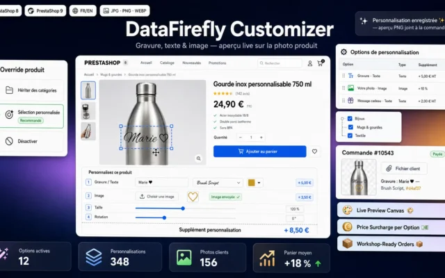
Higher basketEngraving, text and image with live preview. People rarely return what they designed themselves.
Engraving, custom text and image upload with live preview right on the product picture. Each option adds its own surcharge — fixed amount or…
€69.00 View the module -
Text-to-Speech Product Audio Module PrestaShop 8/9
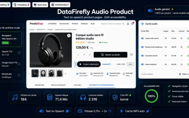
AccessibilityAudio reading of the description. Niche, but genuinely useful on technical catalogues with dense descriptions.
Add a "Listen to the description" button to your product pages: free in-browser speech synthesis or premium OpenAI, Google and ElevenLabs voices, adjustable speed…
€79.00 View the module
Side-by-side comparison
| Module | Best for | Price | Rating | Link |
|---|---|---|---|---|
| Variant Photo Swatches & Stock Module PrestaShop 8/9 | The visual lever | €89.00 | — | |
| Group Products as Variants in PrestaShop 8 & 9: Amazon-Style Color and Size Selector | Every colour on one page | €129.00 | — | |
| DataFirefly Size Guide — PrestaShop 8 & 9 module | Best for returns | €59.00 | — | |
| Video in the product gallery — PrestaShop | Shows what the photo hides | €120.00 | — | |
| Product FAQ — Static Accordion | Best for SEO | €0.00 | — | |
| Quick View Module for PrestaShop 8/9 — Product Quick Preview | Best for comparing | €79.00 | — | |
| Product Customizer — Engraving, Text & Image Upload with Live Preview (PrestaShop 8 & 9) | Higher basket | €69.00 | — | |
| Text-to-Speech Product Audio Module PrestaShop 8/9 | Accessibility | €79.00 | — |
Your product page is your salesperson
In a shop, a salesperson answers questions, shows the colours, lets you try things on, reassures. Online, the product page does all of that — alone, with no follow-up, in a few seconds. Everything it fails to answer turns into doubt. And doubt does not add to cart.
Optimising a product page is not about “making it prettier”. It is about answering, in order, the questions the customer is actually asking — and in the order they ask them.
Four questions, four answers
“What does it look like?” One photo is rarely enough. Variant swatches show the real colours, video shows scale and movement.
“Is it right for me?” Size chart, technical details, personalisation. This is the question whose unanswered version costs the most: it generates returns.
“What about…?” The product FAQ answers the recurring support questions before they are asked — and becomes indexable content in the process.
“Can I compare quickly?” Quick view stops the customer bouncing five times between listing and page before deciding.
The mistake: adding everything
A product page that shows everything shows nothing. Every module in this selection must earn its place by answering a real question. If you do not sell clothes, the size chart is noise. If your product has one variant, swatches are noise. Install what your customer asks for — not what the competition displays.
Further reading
Three in-depth guides from the blog complete this selection: product videos and Core Web Vitals, FAQ schema and rich snippets and Schema.org Product in 2026.
How to choose
The order follows the customer's questions
Do not install by module, install by question. The customer asks, in this order: "What does it look like?", "Is it right for me?", "What about…?", "Can I make up my mind?" Your page must answer in the same order.
Fashion sellers: one special rule
The size chart goes first — before everything else. It is the only lever that both sells more and generates fewer returns. With a 30% return rate in fashion, shaving off a few points goes straight into your margin.
What NOT to install
Anything that answers no question your customers actually ask. A text-to-speech module on a catalogue of three-line descriptions: noise. Swatches on single-variant products: noise. If an element does not make the page clearer, it makes it weaker.
The test that settles everything
Open your product page on a phone and look at what is visible without scrolling. If the image, price, variant selector and buy button are not all four there, your page is broken — and no module will fix it. Fix that area first, then add.
What you gain
The variant at a glance
The customer sees the real colours and available stock without opening a dropdown.
The video that explains size
Scale, movement, materials: video shows what no photo conveys — and cuts the returns caused by disappointment.
Fewer size-related returns
The size chart is the only lever that both sells more and generates fewer returns.
Questions answered before the order
The product FAQ pre-empts questions, lightens support, and becomes indexable content along the way.
Compare without changing page
Quick view lets customers compare without leaving the listing. Less bouncing, more decisions.
Personalisation that commits
Engraving, text, image with live preview: a higher cart value, and people rarely send back what they designed themselves.
From install to results
-
Check above the fold first
Image, price, variant, buy button: if those four are not visible on mobile without scrolling, no module will fix the page.
-
Show the colours
Photo swatches with stock. The customer's first question is "what does it look like?" — answer that one first.
-
Install the size chart
If you sell clothes or shoes, this takes priority over everything else: it sells more and returns less.
-
Open the FAQ
Migrate the ten recurring support questions into it. You answer the question before it becomes a doubt.
-
Add the rest only if needed
Video, quick view, personalisation: only if your catalogue justifies them. Anything answering no question is noise.
“We installed the size chart to cut returns, not to lift conversion. It moved both — and returns were costing us a great deal more than we thought.”
Frequently asked questions
How many modules can a product page take?
Two rules. First: a module that answers no real customer question is noise — a size chart on electronics has no business being there. Second: anything that need not be immediately visible belongs behind a tab or an accordion. Above the fold belongs to the image, the price, the variant and the buy button — nothing else.
Is the size chart really worth it?
Yes, and it is one of the rare doubly effective levers: it reassures before purchase (so more conversion) and prevents the wrong purchase (so fewer returns). In fashion and footwear, size is the leading cause of returns — every point you shave off falls straight into margin.
Does video slow the product page down?
No, provided it is embedded locally and lazy-loaded. The module only loads the video on click: before that, only a still frame exists. The video stays out of the LCP and does not affect your Core Web Vitals.
Is the product FAQ conversion or SEO?
Both, and the second effect is underrated. A FAQ with clean schema.org markup becomes indexable long-tail content: it answers the exact phrasings customers type into search — and that generative assistants quote.
Does quick view actually help?
Quick view saves the round trips between listing and product page — powerful on catalogues with many similar products (fashion, spare parts). On a catalogue of a few very different products, it adds little. Catalogue-dependent, not universal.
What does product personalisation bring?
It raises average cart value and, more subtly, commitment: people rarely send back what they designed themselves. Live preview is decisive — without it, the customer buys blind and is more often disappointed on delivery.
What is the text-to-speech module for?
It reads the product description aloud. Useful for accessibility (visual impairment, dyslexia) and for long descriptions listened to while driving or working. A niche module, but genuinely useful on technical catalogues with dense descriptions.
Do all these modules weigh on load time?
Barely: they all load conditionally, on the product page only. The real enemy of Core Web Vitals is not the number of modules, it is the carousel slider loading fifteen full-resolution images with no lazy loading.
Not sure which one fits your store?
Tell us your context — we answer with a straight recommendation, not a sales pitch.