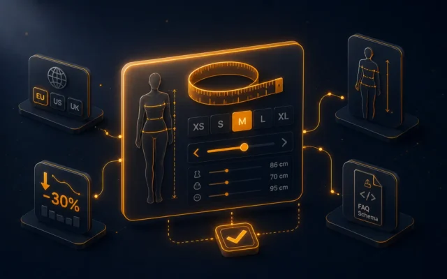
A product page that converts in 2026 isn’t a pretty page. It’s an architected page. On the PrestaShop 8 stores we audit, we always find the same weaknesses: a product hero without clear visual hierarchy, a price block you have to hunt for, social proof tucked too low, decorative cross-sell, and — above all — no orchestration between the elements. The visitor scrolls through an accumulation of components instead of following a mental journey that leads to a purchase decision.
This article details the 12 elements that make up a high-conversion product page in 2026, in the order the visitor consumes them, with their precise psychological role and the technical trade-offs on PrestaShop 8. By the end, you’ll know exactly which modules in your current stack are doing the work, which are missing, and which look the part without contributing.
The 2026 verdict: the product page is still the weak link
In the PrestaShop store audits we run, the purchase funnel typically looks like this: 100 visitors land on a product page, 30 click “add to basket”, 12 finalise the order. The final conversion rate around 3-4% is industry-standard, but it hides an uncomfortable truth — the product-page phase accounts for half the abandonments. Out of 100 visitors, 70 leave without even putting the item in the basket.
Why is this phase so critical? Because it’s at the product page that the visitor decides whether to buy. The basket and checkout, downstream, deal with technical obstacles (shipping costs, payment methods, account creation). But it’s the page that answers the fundamental question: “is this product worth the asked price for me right now?”. If the answer isn’t obvious, the visitor leaves.
The point of a high-conversion product page is therefore to answer that question with maximum clarity — and to answer it in the order that matches a real buyer’s mental path, not in the arbitrary order imposed by PrestaShop’s defaults or habits inherited from 2018-era themes.
The architecture of a product page that converts
A high-conversion product page follows a stable structure around 12 elements, organised in three zones: the hero zone (above the fold, immediately visible), the engagement zone (just below the fold, informational), and the depth zone (long, continuous scroll, deferred or hesitant purchase). Here’s the detail.
1. The product hero: image, gallery, video
The main image is statistically the first element the visitor looks at — even before the title. It must serve two objectives simultaneously: show the product clearly and trigger desire. On fashion, beauty, decor stores, it’s the image that does half the conversion work; on technical stores, the image situates the product (size, finish, usage context) and lets the buyer visually confirm they have the right reference.
A gallery of 4 to 8 images viewed from different angles has become the 2026 standard. Beyond 8, the visitor stops looking. Below 4, they lack visual information. And critically: integrating a product video in the gallery can boost conversion by 20 to 40% on some products — provided the video is short (10-30 seconds), shows the product in real use, and doesn’t impact Core Web Vitals (mandatory lazy load, no preload except on the first frame).
2. The product title
The title must do two things at once: confirm to the visitor that they are on the right page (consistency with the query that brought them), and summarise the promise in one sentence. Overly short titles (“Black dress”) are insufficient in 2026; overly long titles (“Elegant black dress in organic cotton made in France for summer evenings”) are tiring. The sweet spot is 5 to 10 words, combining product name + 1-2 differentiating attributes.
On the SEO side, the page’s H1 title is one of the strongest signals for ranking on long-tail product queries. An effective convention: {Brand} — {Product name} — {Differentiating attribute}. This structure gives context to Google and to the buyer in a single read.
3. The price block
The price must be immediately findable and decodable. Three use cases:
- Simple price: a single price displayed, large, in brand colour. The default case.
- Promotional price: the original price crossed out (grey, smaller) next to the current price (large, in colour), with a “-X%” or “-£X” label. The visual gap must be sharp for the promo to register.
- Tiered price (from): for products with price variants, display “From £29” with a link to the variant detail.
Classic mistake: displaying VAT-inclusive and VAT-exclusive prices on two equal lines, which creates cognitive hesitation. One dominant price (VAT-inclusive for B2C, VAT-exclusive for B2B), the other smaller with a clear note.
4. Immediate social proof
The average rating (stars + number of reviews) must be visible above the fold, close to the title. It’s one of the three elements that decide what follows — alongside the image and the price. Without visible stars, you leave the visitor alone in front of their decision; with stars, you give them a social signal that reduces friction.
To activate this lever, two prerequisites: a verified-reviews module that collects enough feedback to have a credible average rating (minimum 5 reviews, ideally 20+), and Schema.org AggregateRating markup that makes the stars appear in Google’s SERP. Our DataFirefly Verified Reviews module covers both. On pages without reviews yet (new products), a “Bestseller” or “Trending” badge can fill the role of temporary social proof.
5. The primary CTA button
The “Add to basket” button is the most important element on the whole page. Its visibility, colour, and label decide the raw conversion rate. A few rules proven in 2026:
- Contrasting colour against the rest of the page (often orange, red, or green if the brand allows) — not the theme’s dominant colour.
- Actionable label, not generic. “Add to basket” beats “Buy”; “Order now” beats “Validate”. The word must describe the action, not the result.
- Adequate size to be clickable without precision (44×44 px minimum on mobile, ideally more).
- Sticky on mobile: on long pages, the button must stay visible as the visitor scrolls through the description or reviews. Without a sticky CTA, you lose visitors who drift from the top of the page.
6. Key benefits (3-5 bullets)
Just below the title/price/CTA, a block of 3 to 5 bullets summarising the key product benefits. Not the technical characteristics (material, dimensions, weight — that goes elsewhere). Not a long description (likewise). Concrete benefits for the buyer, phrased in words they would use themselves.
Example on a running shoe: “Specific cushioning for soft terrain”, “Breathable upper to prevent overheating”, “Anti-slip sole in wet conditions”. Not: “EVA density 35, mesh 70 g/m², Vibram MegaGrip sole”. The second is a spec sheet; the first sells the product.
This section is often neglected because it requires editorial work: benefits have to be written, product by product. But it has disproportionate impact on conversion because it translates technical specifications into perceived value.
7. Variants without flow disruption
If your product has variants (colour, size, format), the variant selector must be above the CTA button, never below. The visitor configures first, then adds to basket. The reverse creates needless friction.
For colour variants, visual swatches (clickable coloured squares or circles) are systematically more effective than a text dropdown. For sizes, a button selector (XS, S, M, L, XL aligned horizontally) beats a dropdown. And critically: indicate availability per variant — if size M is out of stock, the M button should appear crossed out or greyed, not hide the out-of-stock until the “add to basket” click.
8. The free-shipping bar
A progress bar towards the free-shipping threshold, displayed discreetly above the basket or the product CTA, increases average basket value by 5 to 15% on stores where it’s properly calibrated. The mechanism is simple: the visitor sees they are £12 away from free shipping and adds a complementary product to cross the threshold.
The trap is miscalibrating the threshold. Too high, the visitor abandons instead of adding. Too low, you give away shipping on baskets that would have paid without flinching. The DataFirefly free-shipping bar manages thresholds per country (useful for stores delivering in the UK and internationally with different rates).
9. Product FAQs (Schema-marked)
An FAQ section with 4 to 8 common product questions tackles three goals in parallel: it reduces cognitive friction (the visitor finds answers without contacting support), sends SEO signals via FAQ Schema markup (snippet extensions in SERP), and feeds Answer Engines (ChatGPT, Perplexity, AI Overviews) with structured content they can cite.
FAQs must be product-specific, not generic. “What’s the delivery time?” is a generic FAQ that appears everywhere — Google grants no signal to it. “Does this dress run large or small?” is a product FAQ that answers real purchase hesitation. Manual writing scales up to 30-50 pages; beyond that, the DataFirefly Product AI FAQ module generates these FAQs contextually.
10. The long description (with storytelling)
Below the key benefits and FAQs, a longer description (300-800 words) that develops the product in its usage context. This description has two functions: convince the hesitant visitor who wants to dig in, and feed long-tail SEO (the specific queries that advanced buyers search).
The trap: the long description is often copy-pasted from the supplier catalogue, with no editorial value-add. When 50 e-commerce sites sell the same product with the same supplier description, Google can’t tell the value of each. The description must be written by your team with your angle, your positioning, your vocabulary. It’s work. But it’s what separates pages that climb in the SERP from those that stay buried.
11. Extended customer reviews (with photos)
Further down the page, a complete customer-reviews section: all collected reviews, with customer photos when available, with filters (by rating, by variant, by date). This is where hesitant visitors dig to validate or invalidate their purchase intent.
Three levers that multiply the effectiveness of this section: (a) customer photos showing the product in real-use conditions — they convert 2 to 3 times better than text-only reviews; (b) public merchant replies to reviews (especially negative ones) — showing you take customer support seriously; (c) review verification (a “verified review, purchase confirmed” badge), distinguishing your reviews from the fakes found everywhere. The DataFirefly Verified Reviews module covers all three.
12. Intelligent cross-sell
At the end of the page, cross-sell suggests complementary products. It’s the element that closes the loop: the visitor not convinced by THIS product can discover a related one, the visitor ready to buy can complete their basket with accessories.
The trap of “4 random products from the same category” cross-sell is treated in depth in our 7 cross-sell strategies that work in 2026 article. The synthesis: useful cross-sell combines several weighted logics (accessories, frequently bought together, same manufacturer) with analytics on what converts. Our DataFirefly Cross-Sell module implements this mechanic.
The elements that are not on the page (but matter)
Three adjacent elements complete the conversion architecture without being visible on the page itself.
The sidecart. When the visitor clicks “Add to basket”, the sidecart slides in from the right with the added product + 2-3 relevant cross-sells. This mechanic avoids the flow rupture created by redirecting to the basket page (which pulls the visitor out of the product context). Our DataFirefly SideCart module implements this interaction cleanly.
The wishlist. For visitors not ready to buy immediately, the wishlist button (heart, near the CTA) captures deferred intent. Combined with automatic price alerts and follow-up emails at D+3 and D+7, the wishlist becomes a second conversion tunnel running in parallel with the basket. Module: DataFirefly Wishlist.
Urgency signals. Limited stock (“only 3 left”), time-limited promotion (“offer valid until midnight”), number of people viewing the product in real time. Use sparingly — artificial urgency is easily detected and breaks trust. But real urgency (genuinely imminent stockout, real end of promo) accelerates the decision without manipulating. The CMA has been clear on this distinction since the DMCC Act came into force in April 2025.
Test and measure what actually converts on your page
All these elements are heuristics validated across hundreds of stores we’ve supported. But on your specific store, some combinations will work better than others. The only way to know is to measure.
Heatmap and session recording. Tools like Hotjar, Microsoft Clarity (free), or Smartlook let you see where visitors click, scroll, hesitate. A visitor frantically scrolling the page then leaving without acting is telling you they were looking for something they didn’t find — often a precise piece of information (compatibility, dimension, lead time). It’s a signal to enrich a specific section.
Element-by-element A/B testing. Rather than redesigning the entire page in one go, test elements one by one. CTA colour, price-block position, benefit order, description length. One test per sprint, measured over 4-6 weeks for a statistical signal. Tools: VWO, Optimizely, Convert.com do the work.
Cross-sell analytics by strategy. If you use a weighted cross-sell module, measure the CTR by strategy. Is the “accessories” strategy converting at 12% and “bestsellers” at 4% on your store? Increase the weight of the first, lower the second. Without that data, you fly blind.
Conclusion: the product page is a system, not a page
A high-conversion product page in 2026 isn’t a pretty page. It’s an architected system where 12 main elements and 3 adjacent elements work together to lead a curious visitor towards a validated purchase. Each element has a precise psychological role; each transition between elements must be fluid; each underlying technical module must do its job without degrading Core Web Vitals.
Optimisation is continuous: install the base, measure, adjust. On the stores we support, the move from a standard to an optimised product page typically delivers a 15 to 35% conversion-rate gain on product queries, plus 10 to 25% basket-value lift via cross-sell and free shipping. It’s rarely a few-day project — it’s a multi-month iterative effort.
To put this into practice: our selection of modules to optimise your product pages.