
A customer who selects the green colourway and keeps seeing photos of the red model has no reason to trust what they are ordering. The expected behaviour is obvious, but PrestaShop does not produce it on its own.
How PrestaShop links images and variants
The mechanism exists natively. In a product’s combinations tab, each combination can be linked to one or more of the images on the page.
Two limits explain why this does not work as expected in many shops.
The association is purely manual, image by image and combination by combination. On a product with fifteen variants and twelve photos, the exercise takes time and nobody does it across a whole catalogue.
More importantly, the association does not decide the behaviour of the gallery. Depending on the theme, selecting a variant may filter the images, change just one of them, or do nothing at all. The theme decides, not the association.
The three possible behaviours
Change nothing. All images stay visible whatever the selection. This is the most frequent behaviour, and the worst: the customer has to guess which ones match their choice.
Change the main image. The cover photo switches to the variant’s image, the thumbnails stay unchanged. An in-between behaviour, acceptable on products with few photos.
Filter the gallery. Only the images linked to the selected variant remain visible. This is the behaviour customers expect, and the one that reduces returns.
A fourth behaviour is worth considering: filter, but keep at the end of the gallery the images common to every variant, such as a technical diagram or a close-up of the material.
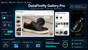 PrestaShop Product Gallery — HD Zoom, Fullscreen & Variant FilterNext generation product gallery: HD zoom, vertical thumbnails, mobile fullscreen with pinch and variant based image filtering.€69.00
Variants with no image
An inevitable situation as soon as the catalogue grows: a new colour is created before the photos are taken.
Strict filtering then produces an empty gallery, which is far worse than no filtering at all. The fallback behaviour must be explicit: if no image is linked to the selected variant, the gallery shows every image of the product.
Also plan a back-office check listing combinations with no linked image. That is a five-minute monthly maintenance task that prevents weeks of degraded product pages.
The multiple-attribute trap
A design point that decides whether the whole exercise is feasible.
A product with five colours and six sizes has thirty combinations. Yet the photos only vary by colour: size M and size L of the green model use the same visuals.
Linking images to all thirty combinations means repeating the same work five times per colour. The right approach is to link images to the visual attribute rather than to the full combination, and let the system resolve the rest.
In practice, the useful rule is: identify the attribute or attributes that change the appearance, usually colour and sometimes material, and only link on those.
Consistency across the other locations
The product page gallery is not the only place involved, and this is what gets forgotten most often.
In the category listing, if you offer colour swatches on hover, the thumbnail must follow the hovered colour.
In the quick view, the behaviour must match the product page, otherwise the customer sees an inconsistency between the two views.
In the cart and order emails, the image must be the one for the ordered variant, not the product cover. It is a detail that prevents complaints along the lines of “this is not what I ordered”.
Performance
Filtering images in the browser means loading all of them. On a product with forty photos across eight colourways, that is a lot of weight for a customer who will only see five.
Two solutions. Lazy loading of the images not on screen, which only downloads them when they become visible. Or on-demand loading when the variant changes, which saves more but adds a noticeable latency.
On most catalogues, lazy loading is enough and stays easier to maintain.
Zoom and fullscreen
One last consistency point: the enlarged view must be filtered the same way as the gallery. A customer who opens fullscreen on one colour and scrolls through all the others loses the trust the filtering had just built.
The Product Gallery module for PrestaShop covers this chain on PrestaShop 8 and 9: image filtering by selected variant with a fallback when no image is linked, consistency between gallery, zoom and fullscreen, and lazy loading of the visuals not on screen.