
A product page has to carry a lot of information without turning into a wall of text. Tabs answer that need, provided you do not bury what decides the purchase and they stay readable by search engines.
What PrestaShop offers natively
The default theme shows predefined tabs: description, product details, and attachments where applicable. Installed modules can add more, each hooking into the same location.
Two limits. The content of each tab maps to a fixed product field, with no way to create others. And the order is determined by module position, not by an editorial intention.
The common result: a “Reviews” tab before a “Specifications” tab, when the customer wants to check the specs first.
Tabs or accordion
The question is settled by screen format.
On desktop, horizontal tabs work well: all the labels are visible, the visitor sees what exists and chooses.
On mobile, horizontal tabs become problematic. Four or five labels do not fit across the width, and horizontal scrolling hides the last ones. A vertical accordion, where each section expands in place, is far more usable.
The solution that works is switching from one format to the other depending on width, keeping the same content and the same HTML structure.
Indexability, the critical point
This is the aspect most implementations get wrong.
Content collapsed inside a tab stays indexable provided it is present in the page’s HTML, simply hidden by styling. That is the standard behaviour and it poses no problem.
Content loaded on click, through an asynchronous call, does not exist at the time of the initial parse. It may be seen during a later rendering pass, but nothing guarantees it, and its weight in the page’s evaluation is uncertain.
So the rule is simple: all tab content must be present in the served HTML. Deferred loading is only justified for heavy elements such as a video or a paginated list of reviews.
A related point often ignored: Google states that it treats content hidden behind an interaction as content of lesser importance on the mobile version. That does not disqualify it, but it argues for leaving what matters most expanded.
 PrestaShop Product Page Tabs — Drag & Drop ManagerTailor-made product page tabs, reordered by drag & drop.€79.00
Which tabs by product type
Three setups, depending on the nature of the catalogue.
Technical product. Specifications, compatibility, documentation, warranty and after-sales. The sales description stays short and expanded above.
Clothing or fashion product. Description, composition and care, size guide, delivery and returns. The size guide should not sit in a tab but next to the selector, with the tab holding the detailed version.
Food or cosmetic product. Description, composition and allergens, nutritional values or ingredient list, storage, origin. Careful: mandatory information must remain accessible before purchase, which a tab allows, but it must not be hard to find.
The order
Three principles.
The first tab is open by default and is seen by nearly every visitor. The following ones are seen by a decreasing fraction. So put first whatever removes the most frequent objection in that category.
The order follows the decision journey, not the administrative order of your fields. Description, then technical check, then reassurance, then logistics.
The order can vary by category. On technical products, specifications come before the description. On homeware, the opposite.
Empty tabs
A systematic problem as soon as the configuration is applied across the catalogue: a “Documentation” tab shown on products that have none.
The expected behaviour is automatic hiding of any tab without content. Obvious, and yet rarely implemented, because configuration is done product by product in the simple cases and globally in the others.
Plan for the reverse case as well: content entered but no tab configured to hold it, which makes the information invisible.
How many tabs
Four to five at most. Beyond that, two effects compound: the labels no longer fit on one line, and the visitor stops reading them.
If you have more content, the question is not how to add a tab, but whether that content belongs on the page at all. A full manual is better placed as a download than as a sixth tab.
Linking directly to a tab
A useful, cheap detail: making it possible to point at a specific tab from a link.
It serves three cases: a “see reviews” link next to the rating at the top of the page, a pointer from a customer service email, and a link from a blog article to a product’s technical section.
Technically, this means each tab needs an identifier and the script must open the right tab on arrival.
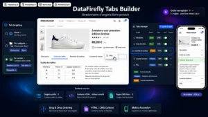
The Product Tabs module for PrestaShop handles this setup on PrestaShop 8 and 9: custom tab creation with drag-and-drop ordering, configuration per product category, content present in the HTML so it stays indexable, automatic hiding of empty tabs and a switch to accordion on mobile.