
A product page answers one central question: is this product right for me? Every objection left unanswered is an abandoned cart, or worse, a purchase followed by a return. The seven blocks below are not about layout but about content: each one removes a specific objection.
They complement the narrative structure of the page. What follows is about the information to provide, not about the order of the story.
1. The size or dimensions guide
Objection removed: will it be the right size?
On clothing, footwear, furniture and built-in appliances, this is the leading cause of returns. A table of real measurements, taken on the product itself rather than copied from a general standard, beats a chart of size equivalences.
Place it next to the size selector, not at the bottom of the page. On furniture, add a familiar reference: “the width of a standard washing machine” says more than 60 cm.
2. The product FAQ
Objection removed: the questions the description did not cover.
Three to five questions, written from the actual requests your customer service receives about this product or its category. An invented FAQ is spotted immediately and serves no purpose.
Secondary benefit: marked up correctly, it can appear in search results.
3. Delivery information
Objection removed: when do I get it, and what does it cost?
This is the block most often missing, even though it carries the most frequent objection. An estimated delivery date, calculated from actual stock and your preparation times, beats a lead time expressed in days.
“Delivered between 15 and 17 September” is actionable. “Shipped within 48 hours” requires mental arithmetic and leaves uncertainty.
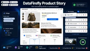 Product Story — Product Page Storytelling BlocksProduct pages that tell a story — without a heavy page builder€79.00
4. The comparison with neighbouring products
Objection removed: is this the right model in the range?
A short table comparing the product being viewed with two or three alternatives, on three or four decisive criteria. It saves the customer from opening five tabs and it keeps the comparison on your site.
Counter-intuitive but verified: showing that a cheaper model might be enough increases trust and the overall conversion rate of the range.
5. The usage video
Objection removed: what does it look like and how is it actually used?
Thirty to sixty seconds are enough, filmed in a real situation rather than in a studio. On technical products, an assembly or first-use video reduces both returns and after-sales requests.
Watch the weight: an autoplaying video degrades page performance. A clickable poster image settles that point.
6. Reviews with customer photos
Objection removed: does it match what is advertised?
Written reviews reassure, customer photos settle the matter. On a colour, a material or a perceived size, a photo taken in natural light by a buyer answers a question your own visuals cannot address.
Two or three photos are enough to produce the effect. Beyond that, returns diminish.
7. Compatibility and after-sales
Objection removed: what happens after the purchase?
On technical products, the list of compatible models prevents the wrong purchase. On durable equipment, spare parts availability and warranty length are selling arguments, not legal small print.
This block gains weight as the price rises. Below 50 euros it is optional. Above 300, it is decisive.
The order depends on the price
These blocks do not carry the same weight depending on the amount at stake.
Small basket, under 50 euros. The useful order is delivery, reviews, FAQ. The customer decides quickly, wants to know when it arrives and whether others were satisfied. The rest adds weight.
Mid basket, 50 to 300 euros. Size guide, reviews with photos, delivery, comparison. Uncertainty about conformity dominates.
High basket, above 300 euros. Comparison, usage video, compatibility and after-sales, then reviews. The customer compares at length and is trying to reduce a financial risk.
What not to do
Putting everything everywhere. Seven blocks on a 15 euro product page produce an endless page nobody reads. Three well-chosen blocks are worth more.
Collapsing everything. Content only reachable after a click is seen by a fraction of visitors, and it may not be indexed if it is loaded on click. What matters most stays expanded.
Copying the supplier. A compatibility block reused as is ends up identical on every reseller site and provides no differentiation.
Measuring
Two indicators per block. The interaction rate, when the block is collapsible or clickable, which tells you whether it interests anyone. And the change in return rate on equipped pages, compared with unequipped pages in the same category: this is where size guides and usage videos justify themselves.
The Product Story module for PrestaShop handles these blocks in a structured way on PrestaShop 8 and 9: dedicated fields per block type, reusable templates per category so nothing has to be retyped, and rendering handled by the theme rather than buried in the description.