
A customer looking at a photo of a sofa on a white background sees a sofa. The same sofa in a living room, with the rug, the lamp and the cushions, shows them a result. Shop the Look turns that staging into a purchase journey: every visible object becomes clickable.
The mechanism is simple. Its success comes down to execution details that only show once in production.
Where it works
Three families genuinely lend themselves to it.
Fashion and accessories, the original use case. The complete outfit answers a question the product page does not address: what to wear this piece with.
Decoration and furniture. The purchase is made by atmosphere, almost never by isolated product. It is the sector where average order value moves the most.
DIY and garden in context. A fitted-out terrace, an equipped workshop, a home-office corner. The visitor discovers complementary products they would not have searched for.
The scheme is useless, on the other hand, on a technical catalog where purchases are unitary and specified in advance: spare parts, consumables, professional products bought by reference.
The photo, first constraint
The result depends more on the image than on the module.
Every product must be identifiable. An object half hidden behind another will produce an incomprehensible hotspot. Compose the scene with the clickable areas in mind, not only the aesthetics.
The resolution must allow zooming, particularly on mobile where the visitor enlarges the image to make out a detail before tapping.
The framing must leave room. A product stuck against the edge of the image cannot receive a hotspot without the tooltip going out of frame.
Also plan the format: a very wide image works poorly on mobile, a square image wastes space on desktop. Two versions of the same scene is the cleanest solution.
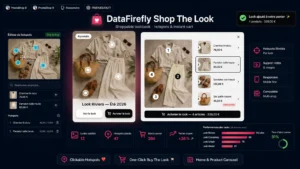 Shoppable Lookbook — Shop the Look & Clickable HotspotsThe shoppable lookbook that turns your photos into sales€79.00
Placing the hotspots
Four rules drawn from real usage.
- Five to seven maximum per image. Beyond that, the scene becomes a scattering of dots and the visitor opens none of them.
- A sufficient touch size. The point must remain reachable with a finger, which means a zone of around forty pixels per side on mobile, whatever the visual size of the dot.
- One point per product, on its most recognisable part. On a chair, the seat rather than a leg.
- A visual cue of clickability. A static dot goes unnoticed. A slight animation when the image comes into view, then a discreet resting state, solves this.
The hotspot content
What opens on click determines conversion. Four elements, no more.
The product name, its price, its availability, and an action. That action must be direct add to cart when the product has no combinations, and a link to the product page when a size or colour choice remains necessary.
Forcing a detour through the product page for a product with no options adds a pointless step. Offering direct add on a product that requires a size produces wrong orders and returns.
Mobile behaviour
This is where most implementations fail. On mobile, a tooltip opening next to the hotspot covers the image and often goes off screen.
The behaviour that works: on tapping a hotspot, a product card appears at the bottom of the screen, full width, without hiding the tapped area. The visitor keeps the visual context and can move on to another point without closing anything.
Also plan a fallback display. Below the image, a classic list of the products present in the scene, always visible. It serves visitors who do not understand the mechanism, and it solves two other problems.
Accessibility and SEO
Both are handled by the same list.
An image with overlaid hotspots is not usable by a screen reader, and the products are not indexable links if the module loads them in JavaScript on click. The HTML list below the image, with a link to each product page, makes the scene accessible and brings the internal linking into existence.
Add a descriptive alternative text on the image, one that describes the scene and not the file name.
Where to place the looks
Three placements, complementary.
A dedicated page gathering all the scenes, structured by universe or by season. It shares well and ranks on inspiration queries.
At the top of a category, one or two scenes from the relevant universe. It is the placement that converts best, because the visitor arrives there already in research mode.
On the product page, a “seen in these settings” block linking to the scenes containing that product. This reverse linking is what drives average order value up.
Measuring
Three indicators. The interaction rate, the share of visitors who open at least one hotspot, which tells you whether the mechanism is understood. The add-to-cart rate from hotspots. And the average order value of sessions that saw a scene, compared with the others: that is where the scheme justifies itself or not, because it costs photo production time.
The Shoppable Lookbook and Shop the Look module handles this mechanism on PrestaShop 8 and 9: hotspot placement on the image, product card with direct add to cart, adapted mobile behaviour, HTML product list for accessibility and the reverse block on the product pages concerned.