
Dark mode has gone from gimmick to expected option in a few years. On operating systems and applications, it has become standard. On online shops it is still rare, and the question of whether it is worth it deserves a serious answer rather than one settled by fashion.
What users actually want
Two distinct motivations, often conflated.
Comfort in low light. This is the main reason, and it concerns evening use, in bed or in a dimly lit room. On a shop whose traffic is concentrated during the day, the stake is small.
Consistency with the system. A user who has enabled dark mode on their device expects sites to respect it. A site in brilliant white opening in the middle of a dark interface produces real discomfort, whatever the time of day.
That second motivation is the one that matters most, and it has a design consequence: respecting the system preference has to be the default behaviour, with a switch to force it either way.
The accessibility point
Contrary to received wisdom, dark mode is not systematically more accessible.
It helps some people, notably those with photophobia or certain migraines. It hinders others: people with astigmatism often read light text on a dark background less well, because of a halo effect around the characters.
What is certain, on the other hand: offering the choice is more accessible than not offering it. The criterion is not which mode is better, but leaving the user to decide.
Two technical rules then follow. Contrasts have to be checked in both modes, which doubles the verification work. And pure white text on pure black is to be avoided: a very light grey on a very dark grey reduces eye strain.
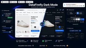 Dark Mode Module for PrestaShop 8/9 — Automatic Dark ThemeThe dark mode your customers expect, without touching your theme.€59.00
The real cost of implementation
This is the deciding point, and it is often underestimated.
On a theme built with colour variables, adding a dark mode is a day of work: you redefine the variables and you test. On a theme where colours are hard-coded into the stylesheets, count several days and a deep rework.
Four items are systematically added, and they are rarely anticipated.
Product images. A cut-out photo on a white background appears as a white rectangle in the middle of a dark page. Handling it means either transparent-background visuals or a neutral thumbnail background.
Third-party modules. Each brings its own styles, which ignore your dark mode. A cookie bar, a chat or a carousel stays light.
Written content. Product descriptions containing hard-coded colours, inherited from a copy and paste, come out unreadable.
Emails. They are not affected by the site’s dark mode, but they are by the mail client’s, which is a separate project.
The logo question
A concrete and systematic detail: a black logo on a transparent background disappears in dark mode. You need a second, light version, and a switch depending on the active mode.
Same problem with icons, payment pictograms and trust badges. Plan for them from the start, or you will discover them one by one in production.
So, useful or gimmick
The answer depends on two criteria you can measure on your own shop.
The share of your traffic in the evening, between 8 pm and midnight. Above 25%, reading comfort becomes a real subject.
Your audience. With a technical audience of developers, gamers or IT professionals, the expectation is strong and its absence is noticed. With an older general audience, it is marginal.
If neither criterion is met, dark mode is a comfort investment, not a commercial lever. That does not disqualify it, but it puts it behind other projects.
If one of the two is met, it becomes an element of perceived quality, on a par with a decent loading time: nobody buys because of it, but its absence is noticed.
What not to do
Three mistakes that turn a good idea into a problem.
Forcing dark mode with no way back to light, in the name of modernity.
Ignoring the system preference and imposing light mode by default on someone whose device is set to dark.
Shipping a partial dark mode, where the checkout stays light. Inconsistency at the moment of payment is worse than having no dark mode at all.
The Dark Mode module for PrestaShop brings this function to PrestaShop 8 and 9: system preference detection with a manual switch, colour adaptation without reworking the theme, a light variant of the logo and coverage of third-party module blocks.