
On most PrestaShop stores, the breadcrumb serves one purpose: going up a level. The visitor clicks “Shoes” from a product page and returns to the parent category. That is useful, but it is a very thin use of an element present on every one of your pages.
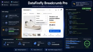
There is a variant that changes the nature of this component: making each level hoverable, and showing the categories of the same rank in a dropdown. The breadcrumb stops being a route back and becomes lateral navigation.
This article covers that transformation. For the JSON-LD markup and how Google reads it, see instead the article on BreadcrumbList markup, which covers the other half of the subject.
The problem it solves
A visitor lands on a “Cordless drill 18V” page from Google. They see that the model does not suit them. Their navigation options are limited: the main menu, which sends them back to the top of the tree, or the breadcrumb, which takes them back to the category they have just seen.
What they are looking for is often lateral, not vertical. They want to see the screwdrivers, or the corded drills, which is to say the neighbouring categories. Today they have to go back up a level to come down again. Two clicks and a page reload, where one would be enough.
On SEO landing pages, that detour is a measurable leak. The exit rate on product pages arriving from organic search is structurally high, and a share of those exits corresponds to visitors who did not find the lateral route.
The principle: each level becomes a menu
The breadcrumb shows, for example: Home > Tools > Drilling > Cordless drill 18V.
Each segment then carries a menu:
On “Tools”, the other top-level categories: Garden, Plumbing, Electrical.
On “Drilling”, the other subcategories of Tools: Screwdriving, Sawing, Sanding.
On the product, nothing, or the neighbouring products in the same category depending on the settings.
The rule to remember: a segment shows its siblings, not its children. That is what makes the navigation lateral. Showing the children simply reproduces the mega-menu in a place where it serves no purpose.
The three variants, and which one to choose
Siblings only. The behaviour described above. This is the default variant, and the one that suits most catalogues.
Siblings plus children of the current segment. The last category segment shows its subcategories. Relevant when the tree is deep and the visitor often lands halfway down.
Siblings plus popular products. On the last segment, a short list of products from the same category with a thumbnail. This variant is the heaviest and the most intrusive. It is only justified on catalogues where the category holds fewer than twenty references.
 Breadcrumbs ProDropdown menus, JSON-LD BreadcrumbList and smart multi-category paths€89.00
How many entries to show
The question is not cosmetic. A dropdown showing forty sibling categories is unusable, and it weighs down every page on the site.
Three calibration rules.
Cap at around twelve entries per level, with a “see all categories” link beyond that. A visitor looking past twelve options is not looking in a dropdown, they are looking in a page.
Order by volume, not alphabetically. Alphabetical order is a default choice that promotes arbitrary categories. Sorting by number of products or by revenue puts the most likely interest at the top.
Mark the current category in the list, in bold or with a dot. Without that marker, the visitor does not know where they are starting from.
The effect on internal linking
This is the aspect most often left out of the decision, and it deserves attention in both directions.
On the positive side, each category page now receives links from every page of its sibling categories. On a catalogue of three thousand products spread across forty categories, that represents several thousand new internal links, distributed horizontally instead of converging on the home page.
On the cautious side, these links are identical on every page, which brings them close to a global navigation element. Their individual value is low. They do not replace contextual linking within page content.
A technical point of caution: if the menus are generated server-side, the HTML of each page grows. Count on between three and eight kilobytes extra depending on the size of the tree. On an already heavy store, load the menus on demand rather than on display.
The mobile case
Hover does not exist on a touchscreen, which makes the dropdown variant inoperative as it stands. Three options, in order of preference.
The tap opens the menu, the second tap follows the link. Standard behaviour, understood by visitors, but it needs a clear visual indicator, a chevron for instance.
A horizontally scrolling breadcrumb, with no menu, and only the last level clickable. An acceptable fallback.
Hiding it entirely on mobile. To be avoided: the breadcrumb is precisely more useful on a small screen, where the main menu is collapsed.
What to measure
Three indicators, taken a month after going live, on product pages only.
The number of pages viewed per session, which is the direct effect expected.
The exit rate on product pages, to compare before and after on organic search traffic.
The click rate on the breadcrumb, to be measured by event. It is the only indicator that tells you whether the component is actually used, and it is often disappointing at first, around 2 to 4 % of sessions. A low figure does not mean the setup is useless: it means it serves a minority of visitors, generally those who are hesitating, which is to say the ones you need to keep.
The mistakes to avoid
Reproducing the mega-menu. If the breadcrumb dropdown shows the same thing as the main navigation, it adds nothing and doubles the weight of the page.
Forgetting the visitor’s actual path. A product attached to several categories shows its default category by default, which is not necessarily the one the visitor arrived through. On internal arrivals, keep the originating category.
Breaking the structured markup. The dropdown entries must not enter the BreadcrumbList JSON-LD, which describes only the path, not the alternatives. This is a frequent error when the menu is added after the fact.
The Breadcrumb Pro module for PrestaShop covers this mechanism on PrestaShop 8 and 9: dropdown menus per level with a choice of siblings, children or mixed, configurable entry cap and sorting, dedicated touch behaviour, retention of the originating category on internal arrivals, and JSON-LD markup limited to the actual path.