
Our best PrestaShop modules for a fast checkout
Seven modules to shorten the funnel — and one metric to stop looking at.
The number of steps in your checkout is not the metric. The number of fields, decisions and surprises is. These are the PrestaShop modules that remove the typing, the password and — at best — the form itself.
Sound familiar?
A funnel that asks for everything, immediately
Mandatory account, a twelve-field address form, an email confirmation. The customer came to pay; you asked them to enrol.
The hand-typed address
Street, postcode, city, country: four fields, four chances to get it wrong — and a delivery that fails three days later.
The password forgotten at the worst moment
The customer already has an account and can't remember the password. They abandon rather than start a reset procedure.
Fees discovered at the final step
The total changes at the payment step. It's the best-documented cause of abandonment, and it has nothing to do with funnel design.
Our selection, ranked
Every module below is built, maintained and supported by our team. The ranking reflects what we would install first on a client store.
-
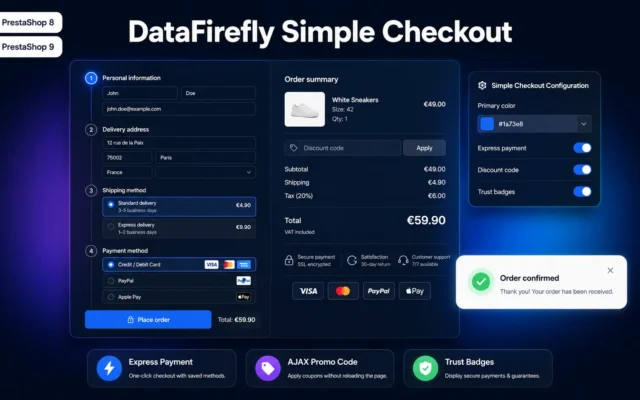
Simple & Elegant Checkout for PrestaShop
Best overallA complete rebuild of the funnel: single page, guest checkout, Google and Facebook login, Google Places autocomplete built in. This is the foundation everything else stacks onto.
Replace PrestaShop's 5-step checkout with a modern, clean one-page layout. Natively compatible with Stripe, PayPal, Alma, Colissimo, Mondial Relay and all your payment and…
€99.00 View the module -
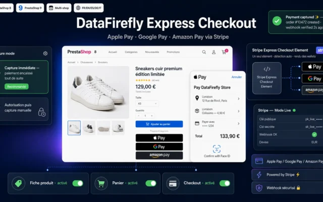
DataFirefly Express Checkout — Apple Pay, Google Pay & Amazon Pay via Stripe (PrestaShop 8 & 9)
The absolute shortcutApple Pay, Google Pay and Amazon Pay via Stripe. The customer fills in nothing: address and payment come from their wallet. The only module that deletes the funnel instead of optimising it.
Show Apple Pay, Google Pay and Amazon Pay buttons via Stripe on the product page, in the cart and at checkout. A single Express…
€49.00 View the module -
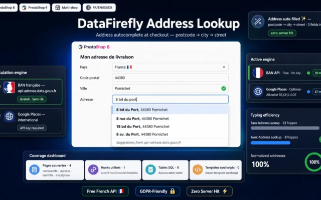
DataFirefly Address Lookup – Checkout address autocomplete for PrestaShop 8 & 9
Best effort-to-impact ratioAddress autocomplete. Five fields filled in three keystrokes, and valid addresses that prevent failed deliveries. Install this first if you install nothing else.
Cut address typos and speed up checkout. The free French BAN API (data.geopf.fr/geocodage) is the default engine, with Google Places available as an option…
€69.00 View the module -
Social Login (Google, Apple, Facebook) for PrestaShop
Best for sign-upGoogle, Apple and Facebook in one click, with a dashboard that measures what social login actually earns you in revenue — not just in clicks.
One-click sign-in via Google, Apple and Facebook for PrestaShop 8 and 9, with a full analytics dashboard, automatic welcome vouchers and a signed CRM…
€49.00 View the module -
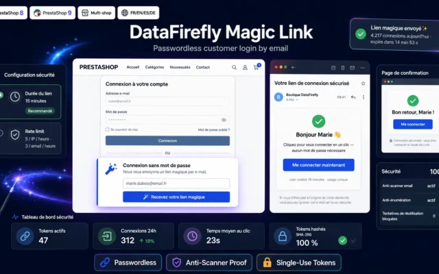
Passwordless Login (Magic Link) for PrestaShop 8 & 9
Zero forgotten passwordsEmail login links. Survives Outlook and Gmail scanners thanks to a two-stage flow — the thing naive implementations get wrong, burning the link before the customer ever clicks.
Passwordless login through a single-use email link. Hashed tokens, anti-prefetcher, anti-enumeration, rate limiting, multilingual emails. Compatible with PrestaShop 8 and 9.
€49.00 View the module -
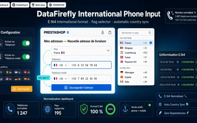
International Phone Input PrestaShop — Flags & E.164 Normalization
The invisible one that countsFlagged country-code picker and server-side guaranteed E.164 normalisation. Fewer input errors at checkout, and phone numbers you can finally use for delivery texts.
Adds a country flag selector with dial code on the phone and mobile phone fields. Automatic E.164 international format normalization in the database. Compatible…
€39.00 View the module -
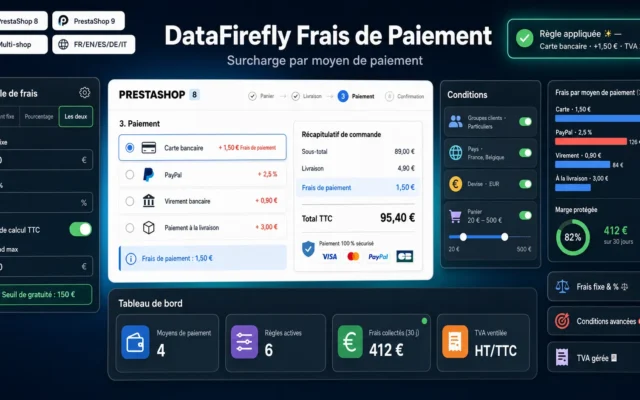
Payment-method surcharges, useful for passing on the true cost of a payment option. But any fee discovered at the last step costs more than it earns: show it from the cart onward.
Add fees (fixed amount and/or percentage) to each payment method on PrestaShop 8 and 9. Rules engine with conditions by customer group, country, currency…
€49.00 View the module

Side-by-side comparison
| Module | Best for | Price | Rating | Link |
|---|---|---|---|---|
| Simple & Elegant Checkout for PrestaShop | Best overall | €99.00 | — | |
| DataFirefly Express Checkout — Apple Pay, Google Pay & Amazon Pay via Stripe (PrestaShop 8 & 9) | The absolute shortcut | €49.00 | — | |
| DataFirefly Address Lookup – Checkout address autocomplete for PrestaShop 8 & 9 | Best effort-to-impact ratio | €69.00 | — | |
| Social Login (Google, Apple, Facebook) for PrestaShop | Best for sign-up | €49.00 | — | |
| Passwordless Login (Magic Link) for PrestaShop 8 & 9 | Zero forgotten passwords | €49.00 | — | |
| International Phone Input PrestaShop — Flags & E.164 Normalization | The invisible one that counts | €39.00 | — | |
| DataFirefly Payment Fees — Surcharge per payment method (PrestaShop 8 & 9) | Handle with care | €49.00 | — |
The shortest funnel is the one you never walk through
Most “checkout redesign” projects open with the wrong question: how many steps should it have? One, three, five? That is a designer’s question, not a merchant’s. The real question is far more prosaic: how many things are we asking the customer for, and how many of them could we simply not ask?
A single-page checkout demanding twenty fields, a mandatory account and an email confirmation converts worse than a three-step funnel asking for eight. Step count is a vanity metric. Keystrokes, decisions and surprises are what you actually pay for.
Three families of levers
Input levers reduce what the customer types: address autocomplete, phone country-code picker, pre-filling. Unspectacular, highly profitable, and they clean up your data on the way through.
Identity levers take the password off the critical path: guest checkout, social login, email login links. A customer who has forgotten their password at the payment step is a lost customer, not a customer to be reset.
Bypass levers make the funnel disappear rather than optimise it: Apple Pay, Google Pay, Amazon Pay. Address and payment method come straight from the phone’s wallet. There is no form left at all.
What actually kills an order
It is almost never the aesthetics of the funnel. It is the unexpected cost discovered at the final step — shipping that appears at payment, payment-method fees added at the end, undisclosed taxes. A customer watching their total change as they reach for their card does not stop to understand why. They close the tab.
No module fixes that. Cost transparency is a decision, not a feature.
How to choose
The one module to install if you only install one
Address autocomplete. It's invisible, it asks nothing of the customer, it removes four input fields on mobile — where your abandonment rate is worst — and it saves you parcels returned for a bad address. It's the only lever on this page whose payoff is immediate on conversion and durable on logistics.
Then, in this order
- Guest checkout — the mandatory account is the most expensive filter in the funnel. Offer the account after the order, once the customer has paid and has nothing left to lose.
- Express payment — Apple Pay and Google Pay at the top of the cart. On mobile, for a substantial share of your customers, the funnel collapses into a fingerprint.
- Removing the password — social login or magic link. A customer who has forgotten their password should never have to leave the funnel to go hunting for a reset email.
- Phone normalisation — the least glamorous of the set, but it governs your delivery texts and the deduplication of your customer base.
The metric to watch (and it isn't step count)
It's completion rate per field: at which specific field do your customers drop out? A one-page checkout with twenty fields converts worse than a three-step funnel with eight. Going single-page is a design decision; removing a field is a commercial one. They are not the same thing, and only the second shows up in revenue.
The mistake you see everywhere
Rebuilding the funnel as a single page… while keeping every field. The result is an endless form you scroll rather than walk through, minus the progress bar that used to reassure people. Plenty of shops have lost conversion points on that redesign while believing they were gaining them. Before touching the step count, count your fields — and delete the ones you do nothing with.
What you gain
The form nobody fills in
Apple Pay, Google Pay and Amazon Pay hand over the address and the payment straight from the customer's wallet. The funnel isn't shortened — it's gone.
An address in three keystrokes
Autocomplete fills street, postcode, city and country in one go — and guarantees the address is genuinely deliverable.
Frictionless identification
Social login or email login link: the customer gets in with no password, no reset flow, no support ticket.
A funnel you can read
One page, strictly the necessary fields, no decorative steps. Clarity does more for conversion than raw speed.
Clean data on the way out
Phone numbers in E.164 format, normalised addresses: fewer failed deliveries, and tracking texts that actually go out.
No surprises at payment
Shipping and payment-method fees announced from the cart onward. Unexpected cost remains the number one order killer.
From install to results
-
Open up guest checkout
The mandatory account is the most expensive filter in the funnel. Offer the account after the order — never before.
-
Plug in address autocomplete
The best effort-to-impact ratio in the set: less typing, fewer errors, fewer returned parcels.
-
Add the express payment buttons
Apple Pay and Google Pay at the top of the cart. On mobile, the funnel collapses into a fingerprint for many customers.
-
Take the password off the critical path
Social login or magic link: someone who has forgotten their password should never have to leave the funnel.
-
Count the fields, not the steps
A twenty-field one-page checkout converts worse than an eight-field three-step one. Measure drop-out field by field.
“We moved to a one-page checkout and kept every field. Zero effect. The curve only moved when we dropped the mandatory sign-up and plugged in address autocomplete — step count had nothing to do with it.”
Frequently asked questions
One-page checkout or multi-step: which converts better?
Neither, in itself. What counts is the number of fields and decisions you put in front of the customer. A one-page checkout with twenty fields converts worse than a three-step funnel with eight fields and a reassuring progress bar. Going single-page helps when it comes with genuine pruning; it achieves nothing if it just stacks the same forms onto one screen.
Do I really need to offer guest checkout?
Yes, and it's probably the most profitable change on this whole page. A mandatory sign-up asks for a commitment the customer has no appetite for at that exact moment: they came to buy, not to join. Offer the account after payment, in one click, built from the details they have just entered. Acceptance rates are far better — and you haven't lost anyone along the way.
Are Apple Pay and Google Pay buttons worth it if I already have Stripe?
Yes, they're two different things. Stripe captures the card; express payment removes the form. With Apple Pay or Google Pay, the shipping address, billing address, email and payment method are all supplied by the phone's wallet. The customer types nothing. On mobile, it is the only lever that turns a three-minute funnel into a fingerprint.
Does address autocomplete do anything beyond saving time?
It has two effects, and the second is routinely underrated. On conversion, it removes four input fields on mobile. On logistics, it guarantees the address genuinely exists and is properly structured: fewer stranded parcels, fewer failed deliveries, fewer support tickets. Plenty of shops pay for it on redelivery savings alone.
Is a magic link reliable if my customers use Outlook or Gmail?
Only if it's implemented properly. Outlook Safe Links, Gmail's preview and corporate antivirus all visit the links inside incoming emails automatically. A naive implementation burns the token on that visit: the link is dead before the customer ever clicks. The fix is to serve only a confirmation page on first access, and consume the token exclusively on the user's real click. It's the mechanism Slack, Notion and Auth0 use.
Why normalise phone numbers when customers don't care?
The customer doesn't — your carrier does. A badly formatted number means a delivery text that never sends, a driver's call that never connects, and a parcel back at the depot. International normalisation also guarantees deduplication of your customer base and usable CRM exports. It's the least visible lever in this selection, and one of the most profitable over time.
Can I charge payment-method fees without scaring customers off?
Yes, on one condition: the fee must be announced in the cart, not discovered at payment. Passing on the genuine cost of a payment method is entirely legitimate, and sometimes necessary on thin-margin baskets. But a total that changes at the last step is the single best-documented cause of abandonment. Show the surcharge the moment the customer picks the method — never after.
Should I install all of these modules at once?
No. Start with address autocomplete and guest checkout: between them, they handle most of the friction. Add express payment next, then take the password off the critical path. Stacking seven modules at once makes attribution impossible: you won't know which one worked, and you may well keep the one that's costing you money.
Not sure which one fits your store?
Tell us your context — we answer with a straight recommendation, not a sales pitch.