
The PrestaShop order funnel was designed for a wide screen. On mobile, where most traffic now happens, it keeps interface choices that cost orders at every step.
Here is the screen-by-screen analysis, with what can be fixed without a redesign.
Screen 1: the cart
Three recurring problems.
The order button below the list. On a five-item cart, it sits below a long scroll. The expected behaviour is a fixed button at the bottom of the screen, showing the total, permanently visible.
Tiny quantity selectors. The plus and minus buttons are often under thirty pixels. The accessibility recommendation puts the minimum touch target around forty-four pixels per side. Below that, the customer hits the wrong button, has to correct, and gets annoyed.
Deletion without confirmation or undo. An accidental tap on the bin empties a line with no recourse. A temporary undo option avoids the full mental reload of the cart.
Screen 2: identification
This is the screen that produces the most abandonments on mobile, and two technical details are enough.
The email field does not call the right keyboard. A correctly typed field brings up a keyboard with the at sign accessible. Without it, the customer goes through the toggle key on every entry.
Autofill does not work. Browsers know how to fill email, name, address and card, provided the fields carry the expected autocomplete hints. A correctly annotated form fills in two taps. A form without annotation forces a full manual entry.
This is probably the most profitable fix in the whole funnel, and it only requires adding attributes to existing fields.
Third point: the password. If you require account creation, the absence of an option to show the typed password produces repeated errors on a touch keyboard.
Screen 3: the address
The address form is the longest in the funnel and the least well adapted.
Too many fields. Many setups ask for company, address line 2, a second complement, landline and mobile phone. On mobile, every extra field is an obstacle. Reduce to the strict minimum and hide optional fields behind a link.
The postcode does not call the numeric keyboard. Same remark as for email: the field type determines the keyboard offered.
The field order does not follow local logic. In most European countries, the postcode is entered before the city, and the former should pre-fill the latter. This autocompletion removes an entire field and reduces errors.
Errors appear after validation. A form that reports five errors in a block after a button tap forces scrolling back up the page. Inline validation, field by field as the customer types, is far less frustrating.
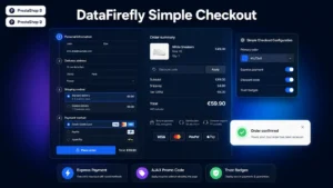 Simple & Elegant Checkout for PrestaShopAn elegant one-page checkout that converts€99.00
Screen 4: shipping
Two problems.
Shipping options in cramped radios. Three carriers presented as compact rows with small radio buttons produce wrong selections. Each option should be a fully clickable card.
The pickup point in an unadapted map. Pickup point modules often display a map designed for desktop, with tiny markers and capricious zoom. On mobile, a list ordered by distance, with the map as an option, works better.
Screen 5: payment
This is the screen where a problem costs the most, since all the previous effort is lost.
The numeric keyboard for the card. The card number, expiry date and security code must call a numeric keyboard. This is still frequently misconfigured, including in recent payment modules.
Card autofill. Browsers and password managers know how to fill a saved card, provided the autocomplete hints are correct. Without them, the customer has to take out the physical card, which interrupts the journey and leaves time to give up.
Redirection to an unadapted bank page. Strong authentication sometimes opens a page with broken display on mobile. Test this journey in real conditions, with a real card: it is the least tested and most critical point of the funnel.
The return after authentication. If the customer switches to their banking app to validate, they leave the browser. The return must restore the session and continue the order, not restart from the cart.
Cross-cutting problems
Four elements that affect every screen.
Automatic zoom on focus. On some mobile browsers, a field with a font size under sixteen pixels triggers an automatic zoom on selection, which shifts the whole page. The fix is to never go below that size in forms.
The keyboard hiding the active field. On a long form, the virtual keyboard sometimes covers the field being filled. Scrolling must adjust when the keyboard opens.
Stacked fixed banners. Fixed header, cookie banner, promotional banner: on a phone screen, sometimes only a third of the height remains for content. In the funnel, remove everything that is not necessary.
Loading time between steps. Every full reload is an opportunity to abandon. A one-page funnel, or transitions without reload, removes these break points.
The diagnostic method
Three actions, in this order, before any modification.
Place an order on your own phone, in real conditions, with a real card and a mobile network rather than wifi. It reveals the bulk of the problems in ten minutes.
Record the completion rate per step, separately on mobile and desktop. The gap between the two locates the problem: if mobile drops at the address, there is no point reworking the payment.
Watch recordings of mobile sessions that did not complete. Hesitations, repeated corrections and manual zooms are immediately visible and point to the problematic fields.
Where to start
If you can only do three things, take these.
The autocomplete attributes on every field in the funnel. Low cost, immediate effect, and it benefits every browser.
The field types, so each entry calls the right keyboard. Same logic, same effort-to-result ratio.
The touch targets raised to a minimum of forty-four pixels on every interactive element in the funnel.
These three fixes require no redesign and address the majority of measurable frictions.
The Simple and Elegant Checkout module for PrestaShop rebuilds this journey on PrestaShop 8 and 9: a one-page funnel with no reload between steps, a lightened address form with city pre-fill from the postcode, field types and autocomplete attributes correctly set, and touch targets sized for mobile.