
The figures circulating about one-page checkout range from 5 to 40% conversion gain. That spread is enough to disqualify all of them: those measurements come from stores whose starting point, catalog and average cart have nothing to do with yours. A store whose native funnel is already well maintained will not gain what a store with a five-step checkout will gain.
The only measurement that concerns you is your own. Here is how to establish it without going wrong.
Why A/B testing is difficult here
On a landing page, A/B testing is simple. On an order funnel, three obstacles stack up.
Volume. To detect a 10% gap on a 2% conversion rate, you need several thousand sessions per variant. A store with a hundred orders a month will never reach significance in a reasonable time.
Session consistency. A customer who sees version A and comes back three days later must see version A again, otherwise you are measuring noise. That requires persistent tagging.
Risk. A bug on variant B for a week costs revenue directly, unlike a test on a secondary page.
For most stores, before-and-after measurement remains the only practicable approach. It is less rigorous, but it becomes acceptable if you control three things.
Before-and-after measurement, done properly
Comparable periods. Four weeks before, four weeks after, avoiding promotional periods, school holidays and public holidays. Comparing November to September makes no sense.
A stable traffic mix. If you launch an advertising campaign the week of the change, you are measuring the campaign, not the checkout. Check the breakdown by source before and after, it must be close.
One change at a time. This is the most broken rule. Modifying the checkout and adding a payment method in the same week makes any conclusion impossible.
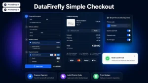 Simple & Elegant Checkout for PrestaShopAn elegant one-page checkout that converts€99.00
The five indicators to record
Overall conversion rate is the result, not the diagnosis. Five intermediate measurements explain what is moving.
- Checkout completion rate: finalised orders relative to entries into the funnel. This is the primary indicator, and it isolates the funnel from the rest of the site.
- Step-through rate. On a multi-step funnel, it reveals which step drives people away. On a single-page funnel, it is replaced by the completion rate of each block.
- Median completion time. The median, not the average, which a single customer who went to lunch is enough to distort.
- Form error rate. How many submissions fail, and on which fields. This is often where the real problem hides: an overly strict phone number format costs more than an extra step.
- Abandonment rate after shipping costs are shown. It deserves its own measurement, because it is the most cited cause of abandonment and it has nothing to do with funnel ergonomics.
Segment by device, always
The mobile conversion rate is structurally lower than the desktop rate, often by a factor of two. A global average therefore masks everything: a 15% gain on mobile and a 3% loss on desktop can produce a flat average.
Since the gains from a simplified checkout are almost always concentrated on mobile, not segmenting amounts to concluding that the change brought nothing.
Segment by customer status too. A registered customer, with saved addresses, does not meet the same friction as a new visitor. The gain is mostly measured on the latter.
Interpretation traps
Seasonality. Conversion rate varies naturally over the year. Also compare with the same period the previous year to distinguish your effect from the underlying trend.
The novelty effect. The first days after a change sometimes show flattering figures that normalise afterwards. Wait at least two weeks before concluding.
Average cart. A checkout that converts better but lowers the average cart can be a bad deal. Look at revenue per session, not only conversion rate.
What actually moves
From what is observed in practice, the gain from a simplified checkout rarely breaks down the way people imagine. It comes mainly from three sources: reducing the number of fields, removing the obligation to create an account, and showing shipping costs earlier in the journey.
Moving from several steps to a single page matters less than those three elements taken together. That is one more reason to measure step by step rather than conclude globally: you will then know which of those levers produced the effect, and which one is still available to pull.
The Simple and Elegant Checkout module for PrestaShop groups the funnel on PrestaShop 8 and 9: entry on a single page, streamlined address form, ordering without mandatory account creation and shipping costs shown before the last step.