
Everything you'd want to know before you install.
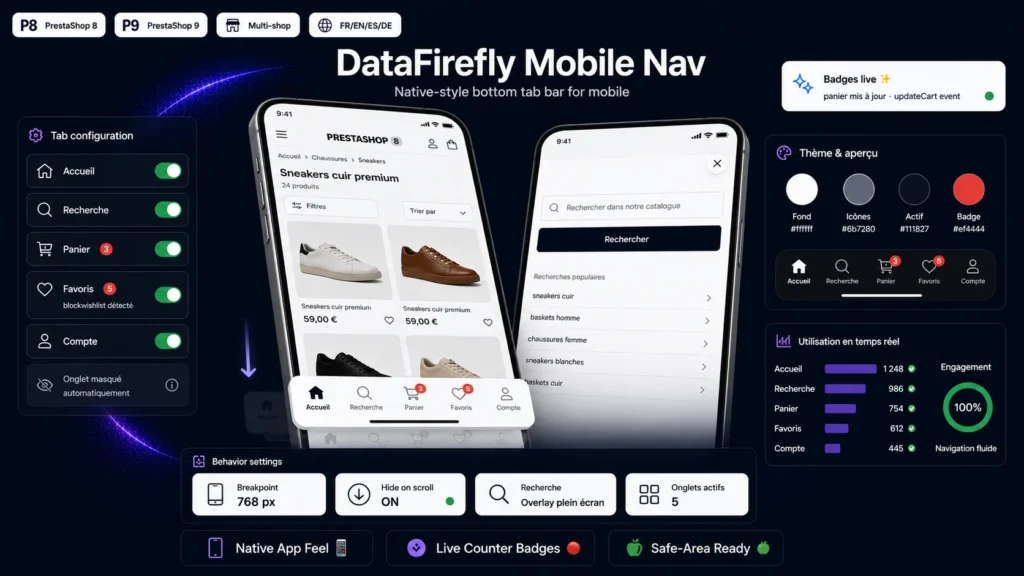
A detailed look at how Mobile Bottom Navigation Bar Module for PrestaShop 8/9 works, why we built it the way we did, and the thinking behind the features above.
The thumb decides, the bottom bar converts
More than half of e-commerce traffic is mobile, and on mobile everything happens in the lower third of the screen — the only zone a thumb reaches effortlessly. Meanwhile, a PrestaShop shop's navigation stays clustered at the top: burger menu, tiny cart icon, buried account. The tab bar moves the five essential destinations to where the hand already expects them.
Badges that keep the waiting cart in mind
A forgotten cart is a lost sale. The counter pill keeps the cart permanently visible throughout browsing and updates live on every add, with no reload. Same for the wishlist: the customer always sees what they set aside, and returns to it with one tap.
Search that doesn't break the journey
The search tab opens a full-screen field over the current page: the customer searches, finds, and gets their context back if they close the overlay. The field is sized to prevent Safari's unwanted zoom on iOS — a detail most themes forget. If you prefer simplicity, a redirect to the native search page is one click away in the back office.
Out of the way when needed, there when wanted
On a long product page or category listing, the bar slides away on scroll down to free up the screen, and returns as soon as the customer scrolls back up. The tab matching the current page is highlighted automatically, the iOS safe area is respected so the home indicator is never overlapped, and bottom spacing is added so no content is hidden.
Light, self-contained, PrestaShop 8 and 9 ready
No icon font, no image, no library: icons are inline stroke SVGs rendered with the page, the JavaScript is vanilla, and the module relies on no framework. It plugs into standard hooks without touching your theme templates, works in multistore, and ships translated into five languages.

There are no reviews yet.