
An 800-word product description can be presented in three ways. The choice looks like an aesthetic one; it is in fact a trade-off between mobile readability, indexing and the amount of information actually consumed.
This article compares the three structures. The technical implementation of tabs has been covered separately.
The three structures
The continuous page. All the content is displayed one section after another, with headings for structure. The visitor scrolls.
Tabs. The content is split into sections, only one visible at a time, selected by horizontal labels.
The accordion. The sections are stacked vertically, each unfolding in place.
These three forms are not interchangeable: they produce different and measurable reading behaviours.
On mobile reading
This is the most discriminating criterion, and it eliminates one option.
Horizontal tabs do not fit across a phone beyond three short labels. The workarounds, horizontal scrolling or truncated labels, degrade the experience: the last sections become invisible and are never opened.
The accordion is the native mobile format. Each section is a full-width block, opening happens in place, and the visitor keeps their bearings.
The continuous page works well on mobile on one condition: that the content is not excessively long. Beyond 1000 words, the visitor no longer finds the information they are looking for and has no way of jumping to the right section.
The most widespread compromise, and the most effective: tabs on desktop, accordion on mobile, with the same content and the same HTML structure.
On indexing
Contrary to a widespread idea, the three formats are equivalent from an indexing point of view, on one condition: that the content is present in the HTML served.
Content hidden by styling is still read. Content loaded on click through an asynchronous call does not exist at the time of the initial analysis.
The nuance that matters: Google states that it treats content hidden behind an interaction as carrying less weight. That does not disqualify it, but it gives a marginal advantage to the continuous page and to the accordion with its first section open.
The practical consequence: whatever carries your ranking, generally the first third of the description, must stay unfolded whichever structure you choose.
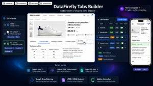 PrestaShop Product Page Tabs — Drag & Drop ManagerTailor-made product page tabs, reordered by drag & drop.€79.00
On the amount actually read
This is where the gaps are widest, and they run in a counter-intuitive direction.
On a continuous page, the scroll rate declines steadily. A substantial share of visitors reaches the first third, a minority goes down to the bottom of the page. But those who go down read everything on their way.
With tabs, the first tab is seen by nearly every visitor, and the following ones by a far smaller fraction. The gap between the first and the second is brutal.
With an accordion, the behaviour sits between the two: the labels of every section are visible, which lets the visitor spot what interests them and open selectively.
The useful conclusion: tabs do not make people read more, they make people choose. If your objective is for the maximum amount of information to be seen, the continuous page is better. If your objective is for the visitor to quickly find the precise information they are after, the accordion wins.
The decision rule
Three criteria, to be applied in this order.
The length of the content. Below 400 words, the continuous page is the obvious choice: splitting up so little text adds clicks with no benefit. Beyond 800 words, splitting becomes necessary.
The nature of the content. If your sections are sequential, meaning they read in order and answer one another, keep the continuous page: splitting up a line of reasoning breaks it. If they are independent — composition, care, delivery, warranty — splitting is natural.
The behaviour of your audience. On a technical catalogue where the customer comes looking for a precise figure, direct access by section wins. On a catalogue where you have to convince, linear reading wins.
The mixed structure
This is what works best in practice, and it is rarely implemented.
The commercial content, the part that creates desire and carries your ranking, stays unfolded on a continuous page, below the buy block. It runs to 200 to 400 words.
The verification content — specifications, composition, compatibility, delivery — goes into an accordion below. The visitor goes there if they need it.
That split follows the real journey: you first read to convince yourself, then consult to verify. It also avoids the main flaw of tabs, which is burying the sales argument behind a click.
The mistakes to avoid
Folding everything away. A product page where even the commercial description is behind a click presents an empty page below the price. The visitor has nothing to read and leaves.
Splitting into too many sections. Beyond five, the labels turn into a menu and the visitor opens none of them.
Vague labels. “Additional information” says nothing. “Composition and care” states precisely what is inside, which raises the open rate.
Content loaded on click. See above: it compromises indexing with no real performance benefit on text.
Measuring on your own catalogue
Three measurements let you decide without guessing.
Scroll depth, marking three thresholds: 25%, 50%, 75% of the page. On a continuous page, it tells you where the reader drops off.
The open rate by section, on folded formats. A section never opened is either badly labelled or useless.
The comparative conversion rate between two equivalent categories set up differently, over a comparable period. It is the only test that really settles the matter, and it requires a sufficiently homogeneous catalogue.
The Product Page Tabs module for PrestaShop lets you set up these structures on PrestaShop 8 and 9: configuration per product category, automatic switch to an accordion on mobile, content served in the HTML so it stays indexable, and a choice of which sections stay unfolded.